
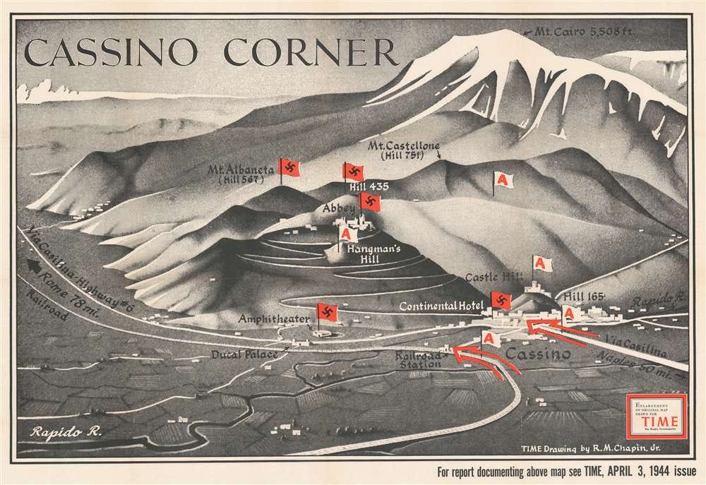
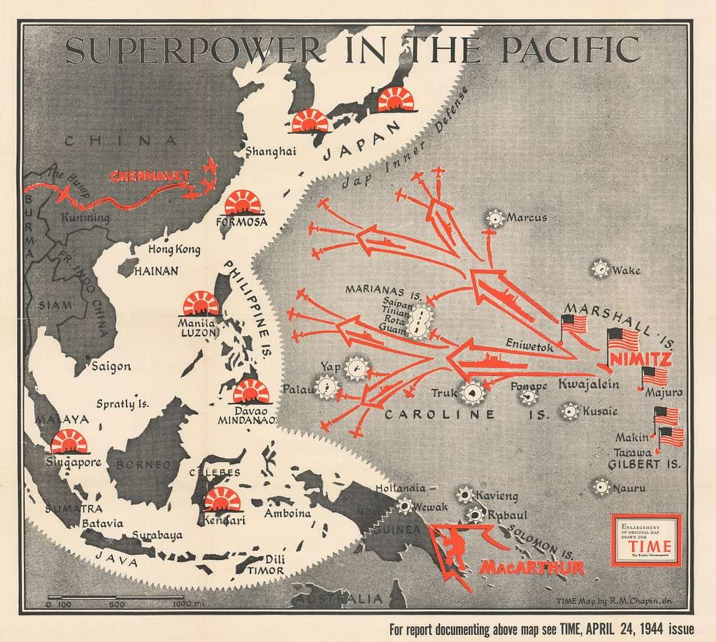
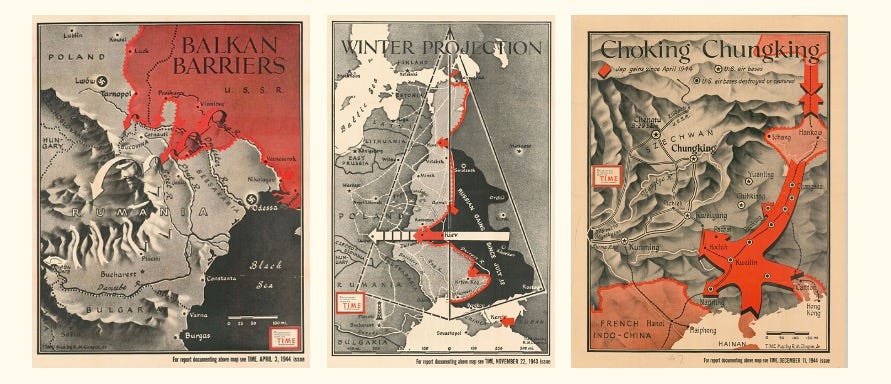
In all, Robert M. Chapin Jr. spent thirty-three years drawing informative maps for TIME Magazine — airbrushing dramatic mountains in grey-scale relief, sprinkling scarlet arrows, and stencilling tiny symbolic flags on top for good measure.
These maps weren’t made to confirm the front lines on any given Tuesday afternoon. Rather, Chapin’s maps were made to help a very frightened readership understand the much bigger picture — where the Second World War was going, and why.
Chapin came to mapmaking, sideways. In 1933, he gained a degree in architecture from the University of Pennsylvania — it was the height of the Depression, and quite possibly the worst moment in American history for building anything. That said, there was plenty of work for a man with a steady hand. Taking the first job he could, working as a photo retoucher for Newsweek, Chapin volunteered to draw a map of the River Nile — even though he’d never drawn a map before — and that, as they say, was that. From then on, he was the map chap.
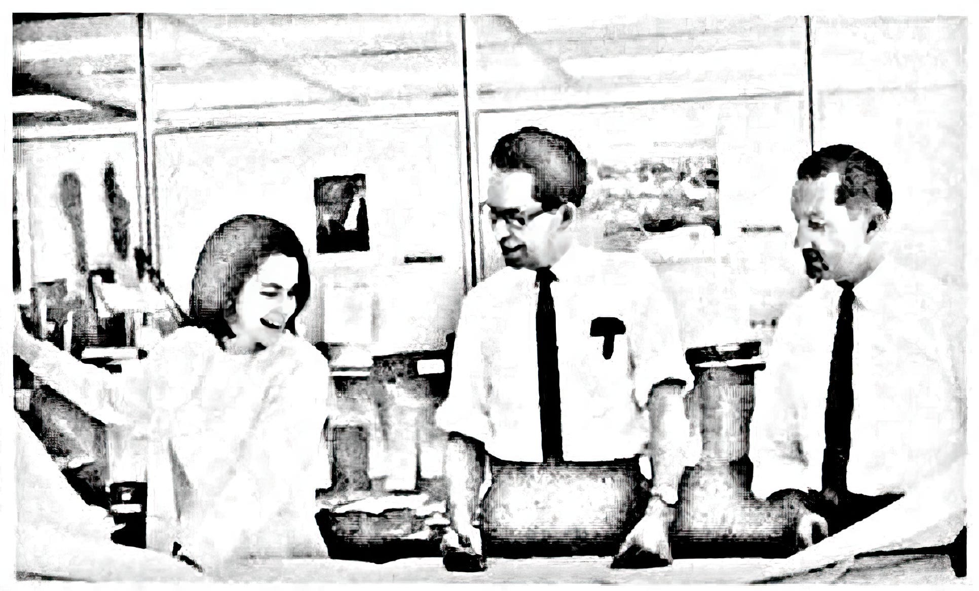
Starting as a staff mapmaker*, TIME Magazine poached him in 1937, installed him in the Chrysler Building offices, and put him in charge of what would become one of the war’s most influential map departments. It started as a one-man operation, Chapin’s first assistant was his wife — Polly Sell Chapin, a fabric designer turned mapmaker — but by the time war had spread to all four corners of the compass, a team of six were producing the artwork for both TIME Maps and TIME Charts every week: researchers, artists, geographers, and draughtsmen.
*Chapin’s official title was Chief Cartographer. Strangely, the word ‘cartography’ wasn’t in common usage during the 1940s ~ it was foisted on the rest of the world by the French in the mid-1800s ~ so for most things WW2-related, I tend to use ‘mapmaker’ instead.
By December 1942 though, and with war now demanding as many as seven maps in a single issue, TIME’s publisher devoted a whole page to explaining who made its maps. It’s a wonderful piece of self-reporting, not least for how unglamorous it makes the whole operation sound:
“Right now this department is keeping five people very busy. Chief Cartographer is Robert M. Chapin Jr., who started his career as an architect and still has the architect’s gift of helping people to visualize a plan.
The tools were as distinctive as the results. An airbrush — ‘like a high-power atomizer’ — gave mountains, valleys and river beds three-dimensional weight. Two enormous globes, one political and one physical, were rigged from the ceiling on pulleys and counterweights, so they could be turned, lowered, and photographed from any angle, vital for the ‘global perspective’ that air and naval strategy suddenly demanded. And an entire library of celluloid stencils was created — bomb splashes, flags, Jeeps, and sinking ships — were created, so that no one had to redraw the same mini-explosions from scratch every week.
Behind it all sat a repository of some 1,500 maps, charts and photographs; a trove of topographic intelligence collected from various map libraries around the world.
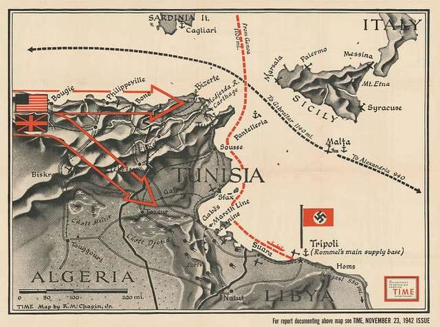
U.S. Hydrographic Office charts and topographic base maps were found easily enough for most regions. Not always at a large scale, but then, Chapin’s work was mostly at a small scale, showing a vast area. In anticipation of the Allied landings, a range of Admiralty charts were acquired from work done by colonial British, French, Dutch, Spanish and Italian surveyors. But still, sometimtes, improvisation was the only way forward. Chapin’s map of Algeria, below, was drawn by combining insights from a French automobile roadmap with the hard-to-find ‘Atlas des Colonies Françaises’ — which says much about the poor state of those map libraries.
Chapin’s team also kept a map bank: basic maps drawn well in advance, ready to be finished at a few hours’ notice the moment the news caught up. This paid dividends: staring at a map of the Pacific and reasoning through where the next battle might take place, Chapin concluded it had to be the Solomon Islands. When U.S. Marines landed on Guadalcanal — TIME’s map of the battlezone was ready in hours.
The maps travelled far and wide. They were borrowed for reference works, reprinted at poster size for schools, lecturers, and Army and Navy officers around the world, and were — improbably — the first maps ever broadcast on television. In short, Chapin’s approach to explaining the bigger picture became a fixture in 20th century culture.
The team maintained its output for thirty-three years in total, making two or three maps most weeks, always on a punishing deadline. The process began at a Thursday story conference, where four or five candidate maps would be sketched out; two or three survived to be finished by 3:30 the next Sunday. His base maps were drawn on a projection table, letting him control scale and trace from the suspended globes for trickier perspective work. One of TIME’s articles described the process:
“The big problem for Cartographer R. M. Chapin Jr. and his staff was to get it all on a two-page map and still make it clearly readable... For the U.S. editions, the map was printed in eight colors — yellow, magenta, green, grey, gold, pink, blue and black. To get sharper differentiation between the lines and patterns, it was printed as if it were a piece of fine art — by sheet-fed offset on heavy paper — and then was bound with the rest of the magazine, which came off rotary letter presses.”
Colleagues described Chapin as ‘slim, relaxed, almost boyish,’ with an easy manner and a penchant for flying whenever he could — the best means to study the ground.
For his own part, he stated his ambition was to ‘dramatize the news of the week, not just produce a reference map like those in an atlas.’ Certainly, his legacy outlasted his time at TIME. Robert M. Chapin Jr. lay the groundwork for a fusion of storytelling that still shapes the way we consume media today — a bit like Substack.
A first substack is always a dilemma.
Stick around, and you’ll find me writing about all kinds of WW2 maps, and the men and women who made them. Illustrators like Chapin, yes, but more so the mapmakers who did more to help win this war than history has led us to believe.
If this is your kind of rabbit hole, then you’re in the right place.
Was there a security risk in what he published/ a screening process?
Excellent, thank you