


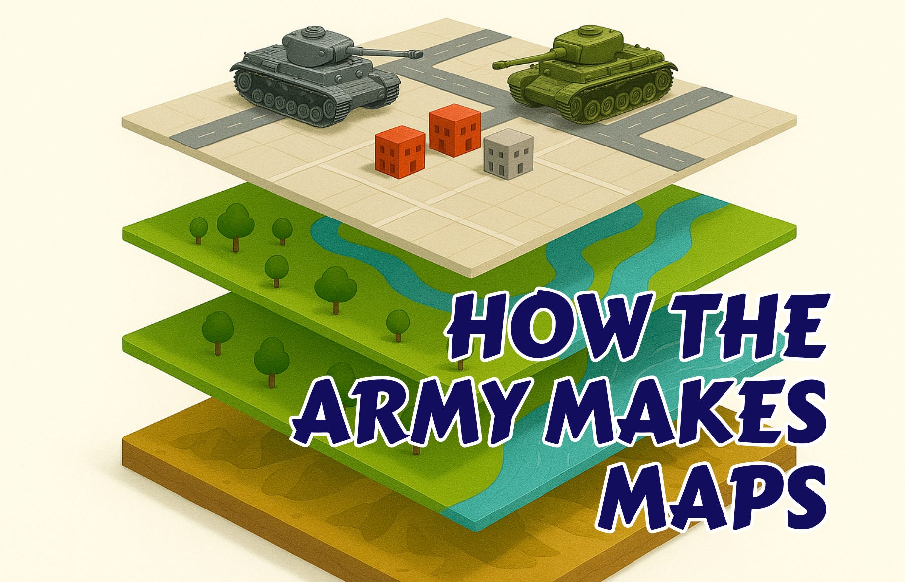
How The Army Makes Maps
‘How The Army Makes Maps’ - that’s how started his blog, and I went along for the ride. I’ve got nothing but good things to say about TD; he’s a top chap, official. That said, about three paras in, I also wanted to throw several things across the room, not least my laptop.
Spoiler - none of this is TD’s fault.
The blog was about military mapping, and I’m the first to admit, a) my interest lies more in Second World War maps and mapmakers, than modern-day shenanigans; b) I have opinions about the title, because it’s a bit like saying ‘A Blog About War In General’, and c), to be fair, TD was always going to be pushing water uphill with this subject. The trouble was, the substance of his blog was a bit like knitting custard.
So if I may, I’d like to explain it.

TD was spot on in his opening gambit - no matter what the SDR says, or what the British military can or can’t afford in the way of tech, there will always be a need for printed maps. Electronic paper doesn’t have unlimited battery life; it can’t be folded into squares; it hates water; and it comes with two hard core defects baked in: it’s a) dependent on power, and b) it can be intercepted.
The blog started by showing some very sexy trucks, all assigned to something called the Future Deployable Geospatial Intelligence (FDG) project. That was part of something that brought a whole raft of smart techies together about 15 years ago, but the FDG is what we’re focusing on here - and I should preface this all with a caveat that this is how the British Army used to make maps about 15 years ago. Anyways, FDG did maps. Or as the blog put it:
FDG delivered a data centric, geospatial intelligence (GEOINT) management, discovery, dissemination and exploitation capability that addressed deployable requirements of the Intelligence Collection Group (ICG), including the provision of mobile and manoeuvrable working environments at the tactical level.
– but right about there is where we went off the rails.
All it meant, is that the ICG needed maps in the field, and the FDG stepped up to make it happen. That’s it. That’s all it said, start to finish.
Long version? Sure. FDG didn’t just provide maps, it also pulled together all the information needed to keep that mapping up to date and make it all lovely and accessible – but that’s big. Huge, in fact.
Our physical world is vast. The more we learn about it, the more we want to use and share that information. Data, baby – buckets and buckets of data. So many buckets of data, you need a team to a) look after it (management), b) make sure you’re folding in new insights as soon they’re available (discovery), c) you can share what you’ve learned with the right people, at the right time (dissemination), and d) you can help everyone to get the most from their new, mapping super-powers (exploitation).
Better? Good. Next up though, we discovered that:
‘FDG essentially consolidated several UORs such as the DataMan servers introduced during Op HERRICK and improved capabilities across the board. It allowed subject-matter experts to maintain over 350 individual geo-referenced layers such as CIED, medical, imagery, patrol tracks and route characteristics.’
Um, right ho.
We’ll leave ‘improved capabilities across the board’ to one side. That’s fluff. It’s ‘geo-referenced layers’ that’s the biggie. Let’s start with acronyms, because that will take us through the tech. Now then. This is a sexy bit.
DataMan was a system that brought bucket-loads of information together, literally, in a way that made it possible (and easier) to manage, store, share, and use it securely. The official description spells it out: DataMan delivered a common geospatial picture (it showed you where things were on a map), and it did so via a secure online browser called GeoViewer (um, you needed something that would connect to the interwebz). When all this data came together, it had one thing in common – everything had a location.
DataMan itself sat on Dell servers housed in ruggedised cases, weighing approximately 300 kg. Remember when computers were in big ol’ boxes, not in your pocket? Yeah, those. Rufty-tufty boxes. Hence the sexy trucks.
Data Man Light reduced the weight by using Helix GIS Servers based on Getac X500 rugged laptops. Fairly straightforward. Now for the tricky bit: the front end (that’s the bit us normal people tend to think of as ‘a web page’, or ‘the bit you jab your mouse/finger at to make things happen’) ... that front end used GeoViewer.
GeoViewer? Looked like Google Maps. You could switch layers of information on and off at will – just the same way do on your mobile phone – and if you wanted to, then you could set it up to look the way you wanted it to. Same way you’d tweak a profile on Insta, or Faceberk, or whatever the kidz are using these days. But it’s those layers that are interesting.
Know what a geo-referenced layer is?
It’s a bucket of information about things that’s been given attributes – labels – so we know where things are and also what they are, exactly. Might be pubs, could be river crossings. Maybe it’s hospitals or tactical vantage points, could be local terrorist cells – quite simply, it’s about using location information (co-ordinates) to pinpoint where things are in the landscape.
That’s called geo-referencing, or geo-locating data.
And once data’s been geo-referenced, guess what? You can then plot it on a map. And if you’ve got one map that shows where the bad guys are, and another that shows where they chillax when they’re not plotting death and destruction, then you can layer those maps, one on top of the other. Maybe even send someone to have a quiet word.
Putting lots of disparate things into context helps decisions get made, with confidence. And because a precise location is a single version of the truth, different decision-makers can bring their opinions to the table with no fear of confusing the situation. Everyone – from the team sat in a truck making the system work, to patrols on the ground, to Men In Charge Behind The Lines – can be referring to the same, accurate insight about what’s happening, where.
As an aside, I said ‘in the landscape’, but I could have said ‘in the domain’. Location isn’t confined to ground-based action. It’s not necessarily three-dimensional, either. Think about time as a fourth co-ordinate. Imagine the possibilities, if you knew ‘whereabouts’ in the dark web terrorists were planning the next big thing. If you can think it, then you can map it into a geo-located reality – or did you not realise, that’s also what a mind-map is?
Okay, back to the plot: TD’s piece told us that, “Where communications networks are constrained or intermittent, cached data can be used, and a contract award to iOra enhanced this important aspect.”
Again, this bit is probably only interesting for map nerds.
One of the biggest drawbacks for any group of people that wants to share information today, is that it’s hard to flatpack data on a pigeon, and there’s an Awful Lot Of It (data, not pigeons). To make information fly through the air, it needs energy. Feathers won’t cut it. You need electricity. Yes, you could use batteries, but it ain’t goin’ nowhere if there ain’t, no, juice.
And then a map – the green bits between the blue bits; the blobs that are houses; the little numbers showing how high the hills are – all of those tiny bits of information take up space. They eat bandwidth, which is unhelpful if you’re in an area that’s not got a great communications’ network. But do you need it all? I mean, do you need every piece of information on a map?
Not usually.
If you’re in the middle of nowhere, and need to know what’s ‘here’ and ‘there’ specifically – then the chances are, you don’t need to know everything about ‘every’, ‘thing’ else at the same time. That’s where iOra came in, in TD’s blog.
To say that iOra ‘crunched’ or ‘scraped’ the information being used to create each map would be doing it a disservice ... but that’s close enough.
iOra does the same thing, still, for pretty much every government institution anywhere, sending massive amounts of information. It offers up what’s needed, leaves out what’s not, and punches that information through a very narrow bandwidth, super-super quick. Better than that, it offers up a cache in the interim – a stored scrape of the most recent version (until you can get up and running again).
Don’t get me started on ‘winning on the digital battlefield’.
I’m fun at parties.
As you can see, there’s a bit more to maps than mapping these days, and even if this hasn’t wooed you or encouraged you to read TD’s original post, I urge you to dig into his archive. It’s a Very Interesting Place.
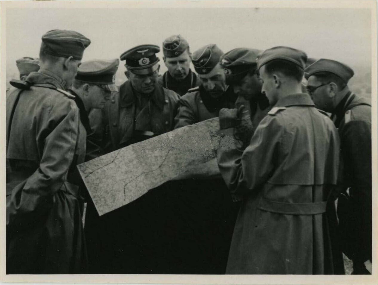
Thing is though, mapmaking wasn’t so very different back in the 1940s.
No, there weren’t any massive servers crunching data; and yes, maps were hand-drawn instead of being rendered – pencils, not pixels; simple ledgers not siloes – but still, mapmakers were simply interpreting the vast quantities of data that had been accrued over a long period of time: trigonometrical data, pin-pointing locations in the landscape, from which any and everything could then be referenced and drawn on a map.
And if, fifteen years ago, someone looked at a map of, say, the Ardennes – on via GeoViewer; via a web-based browser; via a laptop or even a mobile phone – then what they would have been seeing is simply an interpretation of the same information used to create maps for Göring and Gort, in 1940.
Now that should make you think.
A question if I may. Couldn’t all this snazzy kit be knocked out, even locally, perhaps only briefly by an EMP weapon?