
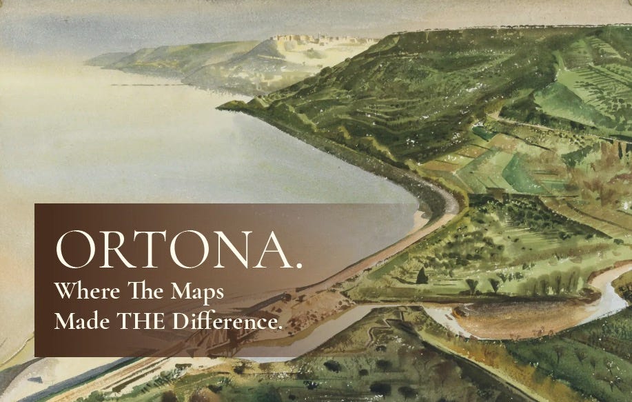
This week, the chaps at We Have Ways gave us a top-notch gallop through the Allies’ advance to Ortona, on the east coast of Italy. Few can match James Holland when it comes to finding personal stories that bring history to life, and this small corner of the Second World War is a dark moment that merits more time in the spotlight.
Even so, through no fault of their own, both James and Al Murray missed one crucial aspect of those events in November and December 1943. Much of the Allies’ hardship and most of the tragedy can be blamed on the maps. Here then, is a hasty follow-up with an overview on some of that mapping, and the reasons it cost so many lives.
ORTONA IS ~ WHERE, EXACTLY?
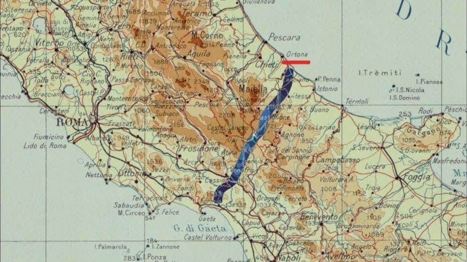
Let’s start with a little geography. We tend to think of Italy as a north–south affair; a thin boot sitting tall, garter to stiletto heel. Histories of the Allied thrust offer a tidy picture, giving the impression of a slog ‘north’ towards central Europe. Men climbed the leg inside that boot: Americans on the left, the British and everyone else – Indians, Canadians, New Zealanders et al – on the right, all aiming to meet in Rome. Geography is a strange thing. So is history. Neither pays much heed to tidy pictures.
In reality, the boot sits at a slant: the defensive lines constructed by Organisation Todt ran south-west to north-east, as you can see above ~ at right angles to the direction of travel, giving short quarter to the terrain. Ridges, rivers – pulsing varicose-veins, such as the Sangro, and the Moro – as well as deep, broad, U-shaped ravines, like the one that the Canadians referred to as ‘the Gully’. That, formed by a creek called the Fosso Saraceni, lay just to the north of the River Moro, south of Ortona town proper. The Gully had to be crossed. There was no going round it.
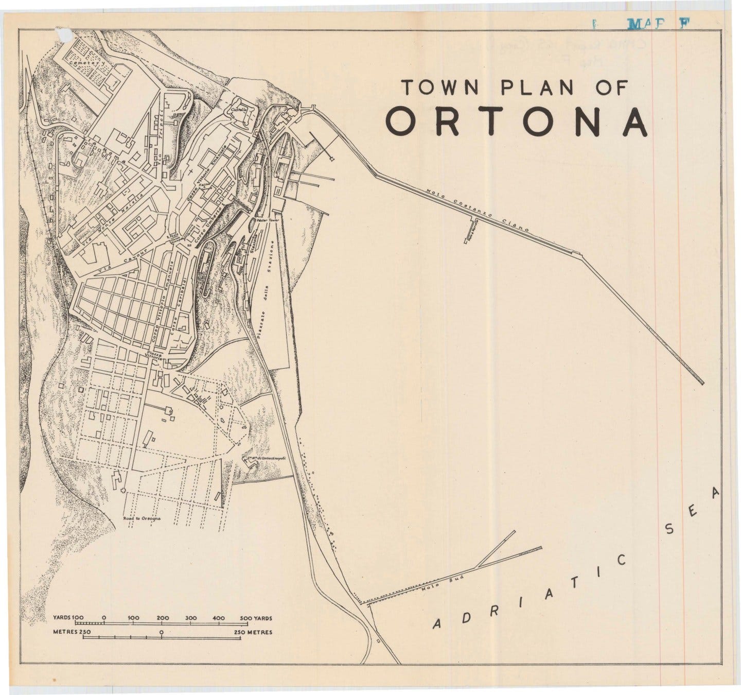
In the winter of 1943, the Abruzzo was a brutal region. Picturesque, but brutal. Passes and tracks and switchbacks; acacia bushes; splintered vines; rolling, spine-pricked waves of verdant undergrowth; soap-scented olive groves; ruinous rural settlements and shattered lives; and the rotting corpses of bloated pigs and dead pack-mules. Men, too. Butchered and blackened, marking the progress mile by mile, of armies suffering badly in a harsh, wet winter. Ortona itself – a medieval, deep-water port, essential to supply lines – sits on a headland: a strategic checkpoint; a coastal chokepoint; and – in the 1940s – poorly served by the few metalled roads running in and out of it. Tight, tall and narrow at its heart; dense alleyways that, over time, had expanded into neat, criss-cross rows of modern construction ~ the new town to the south-west.
In a bird’s eye view, those streets were logically defendable, depending on who was trying to defend them. And to be honest, the answer to ‘Will a Sherman fit down that street?’ is usually, ‘It will in a minute.’ This is the town at a large scale.
Scale is important in this story.
A ONE-MINUTE MAP LESSON
Scale. A map at a scale of 1:50,000 shrinks the world 50,000 times. One centimetre on paper is half a kilometre on the ground in metric terms, so a field and a farmyard are a few millimetres apart. At a scale of 1:25,000, everything is twice the size: four centimetres to the kilometre, or about 2½ inches to the mile. That scale shows individual buildings, hedges and tracks – it’s the fighting scale for most armies.
After the First World War, the British Army decided 1:25,000 was the better option for close conflict, and the ideal solution for its artillery. Ordnance Survey started – slowly – creating a 1:25,000 map of Britain, tactfully calling it a ‘2½-inch map’ so that nobody would notice the change to metric measures. Post-war budgets were tight. It paid little to infer too much progress, too far, too fast. But by 1939, most of the British Army had agreed which maps it wanted, wherever it was being sent. Having those maps in hand, and being able to trust them, was another thing altogether.
The grid. Military maps carry a grid of numbered squares. Any point within them can be given as a 6- or even an 8-figure grid reference, which works much like a postcode for a patch of ground, some 100 metres deep and wide. A gunner needs two of these references: one that defines where his gun is accurately, and one that has a stab at pin-pointing the target. From those numbers, he can calculate a direction and a distance – squint a bit, think about parabolas – set his sights, and fire.
Gunners do not need to see their targets. That is the joy of geodesy: the science of accurately measuring and understanding the Earth’s geometric shape, gravity field, and orientation in space, and how those properties change over time – it’s the very thing that gives men a quasi-religious faith in mathematics, because as long as the maps and surveys are accurate, it delivers repeatable miracles. Remember that.
WHERE ITALY’S MAPS CAME FROM
Before 1861, mainland Italy was a patchwork of kingdoms, duchies, republics and papal states, each with its own surveyors, measuring units, and opinions about how a map ought to look. Teams hauled survey instruments up mountain-sides to fix survey points for posterity: stone pillars on hilltops, iron bolts sunk into bedrock and church steps, wooden signal frames on the summits. It was back-breaking work, done to the best standards of the day, and Italian mapmaking was – still is – admired far and wide. This is the land of explorers, after all.
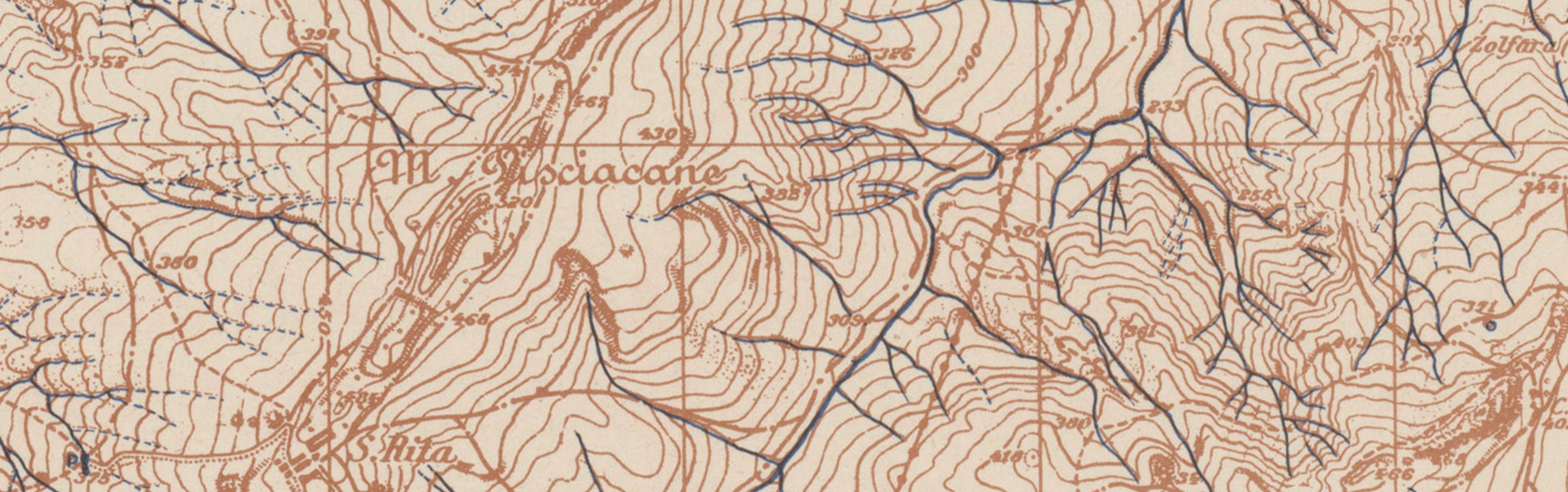
If we set aside the truism that pack-mules occasionally decided this was close enough to that summit – then, all in all, the results were actually pretty good, bearing in mind the time, the budgets, and the technologies available. It’s what happened next that matters. The trouble, in 1943, wasn’t the quality of those original surveys. Rather, it was the cultural affinity with ‘domani, domani’ that had most impact, along with the economy, and the politics of the day. Large scale maps of the plains and industrial north were revised ~ keeping up with changing appearances ~ while the agricultural south and undulating interior, simply weren’t. And at scales of use to the military, such as at 1:25,000, any sheets that were printed in the interim, were usually made with contours inked in black or brown alone. In hill country, Italian mapping looked like fingerprint whorls. Prime example, voila:
That was Italy’s military mapping legacy, shared far and wide. It was not unusual for countries to swap / acquire / purloin / purchase entire map series of other nations. Now add a war, light the blue touchpaper and stand well back.
HOW THE ALLIES MADE THEIR MAPS OF ITALY
The Allies – the British, the Canadians, the Americans et al – did not send field survey units to double-check or update Italian counterparts’ work of ages past. There wasn’t time. There weren’t the spare resources. There was no real opportunity either – there was a war on, dammit.
Instead, Britain’s GSGS – the Geographic Section of the General Staff – photographed and produced copies of maps that had long-since been made by the Istituto Geografico Militare, the Italian army’s mapping service. Reprints of old maps, based on geriatric surveys. The first British edition of the 1:50,000 series (GSGS 4229, if you’re keeping score) was a black facsimile of the Italian map, made at the same scale. The only addition was the South Italian Grid – in other words, the British took an Italian map, printed a British grid over it, and called it a British map. Complete with its original errors; all beautifully photographed, and very slightly blurred.
Later editions added colour. Detail was printed in a grey-blue ink – gris-bleu in French – which British soldiers promptly called ‘griblets’. The colour changed to brown, the name stuck. Roads were picked out in red; water in blue; a diagram in the margin showed which parts were ‘revised from air photos’ – spoiler alert, not very many – and apart from that, the word ‘revision’ did the kind of heavy lifting usually associated with body-builders. The paperwork said maps had been revised. The body-count soon started casting aspersions on that statement. Still though, the real problem was the age of the originals. The north of Italy, Sardinia, and the west coast from Naples to Rome had been surveyed from around 1930 onwards. For the rest of the country, most maps were pre-1920, many of them still reproducing the detail from surveys done in the 1860s. Just think about that for a moment. Really think about it.
A nation coming together; investing; constructing roads, albeit slowly; developing its infrastructure as fast as it could – was defended and attacked with maps drawn from views last seen 70 years earlier. In December 1943, Canadians fought up the Adriatic side of the mainland across 20th-century ground using maps drawn for 19th-century farmers. Some of those farmers’ grandchildren were probably shooting at them.
THE 1:25,000 AND 1:250,000 MAPS THAT WEREN’T
The artillery expected maps at a scale of 1:25,000. In theory, that’s easy. Take a map at a scale of 1:50,000 and enlarge it to twice the size. Voila. And that – where no decent Italian 1:25,000 map was to hand – is exactly, unfortunately, what the Allies did.
Enlarging a map is like enlarging a holiday snap of an old flame. Everyone gets bigger. Nobody gets any better-looking. A road that is 200 metres out of place on a small map is still 200 metres out on the large one; it’s just more convincing and easier to believe. Proper, new 1:25,000 sheets for the Italian mainland – updating old maps with details gleaned from recent aerial surveys – only started to appear for the Allies in the spring of 1944. Ortona had to be taken in the winter of 1943. Whether the sheet on a Canadian gunner’s table that December was an Italian original or a blown-up 1:50,000, it still rested on the same elderly survey. It looked like a 1:25,000 map. It wasn’t a 1:25,000 map in any sense that mattered to a gunner. And what’s just as relevant, is the maps used in planning that gunner’s action – collation maps at 1:250,000 scale.
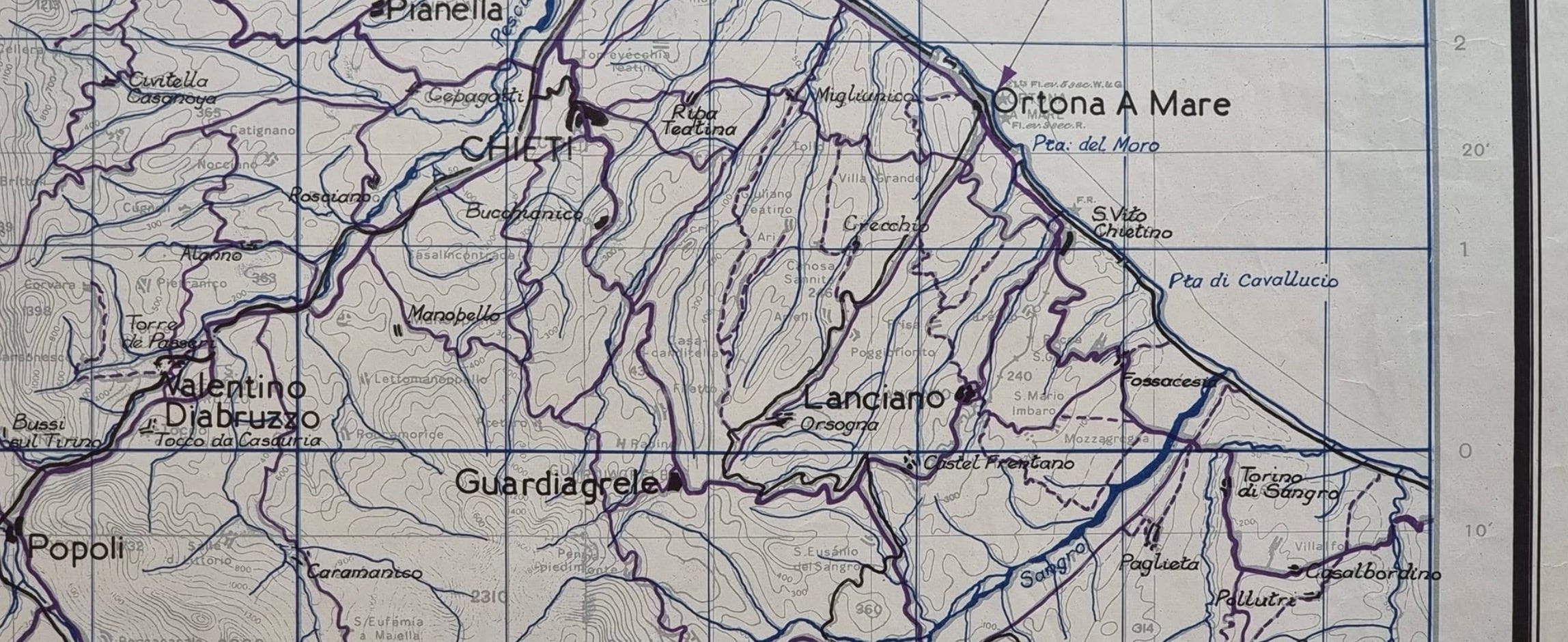
This excerpt is from one such sheet, printed by 512 Field Survey Company RE, made by ‘Staff Officer (Intelligence) Levant’ in April 1943. The chances of it being updated before the Canadians entered the scene were remote. Maps at this scale show rivers, roads, rivers, and major towns that – unless it’s a map of Coventry or Dresden – are unlikely to change much over the space of a few months. Caveats do abound though, a few of which are evident here:
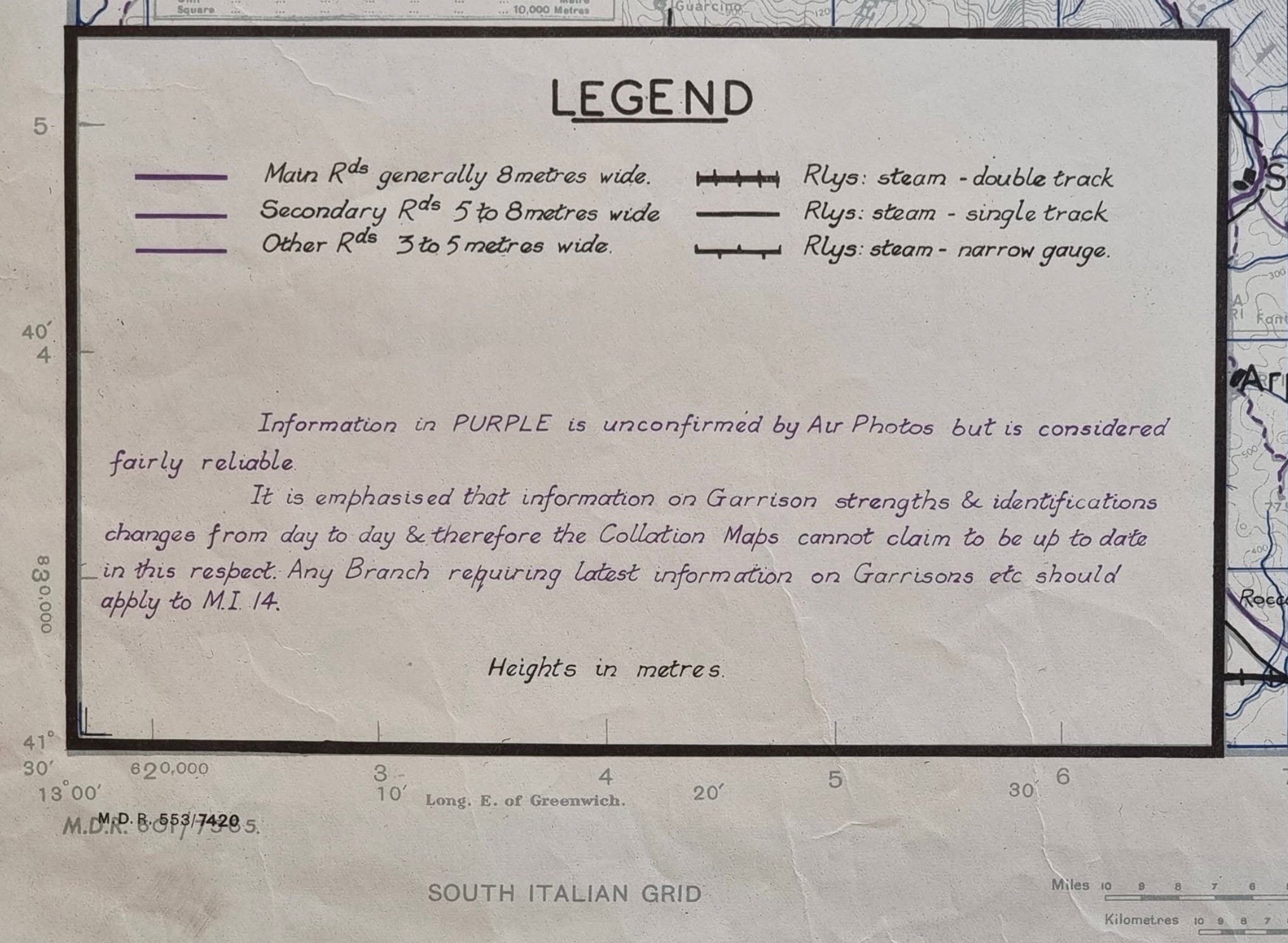
On any collation map though, general topographic features are the main event. Seeing them at this scale, strategic decision-making – projected lines of advance; assumed lines of objection; expected lines of conflict – become understandable.
At this point, James Holland and Al Murray remind us this was one of Italy’s harshest winters; rivers were torrents; the mud and the blood were intermingled; the Allies had pushed forward with pack-mules supporting stretched supply lines; Germany was under pressure but that pressure was exerted on well-established defensive positions; and Abruzzo – beautiful, scenic, breath-taking Abruzzo – was a region riddled with sky-scraping ridges, thorn-filled ravines, craters, shale slopes... you get the idea.
“REVISED IN OCTOBER…”
Canada’s post-mortem on this front is bleak by any standard: “... during January 1944 – 1944 – Eighth Army fought along the Ortona–Guardiagrele front where the 1/50,000 maps were found to be very inaccurate. They had been revised in October from incomplete, small scale photo-cover, but it was clear the original survey was of inferior quality. More accurate and legible maps were requested by the artillery.” One can only imagine the tone of voice around ‘requested’. The phrase ‘small scale photo-cover’ is doing a hell of a lot of lifting.
To update a map with details from the air, ideally those details are gleaned by the right aircraft, carrying the right camera, flying steadily and predictably in a pattern that runs to-and-fro, and always at exactly the right height. Not almost. Exactly. The ideal bird for the task was the Mosquito; fast, twin-engined, with room for more than one camera. The RAF wanted its Mosquitos for reconnaissance and was extremely reluctant to release them for survey work – understatement of the war.
Three were sent to the Mediterranean. Those were recalled. That left survey units largely dependent on the American F-4, a photographic version of the P-38 Lightning. To stay alive, it flew at 25,000 to 30,000 feet. From that height its standard 6-inch camera produced photographs at roughly 1:50,000 to 1:60,000 – which was about the same scale as the very same maps that needed correcting to 1:25,000. Imagine it this way: try to update a street map from a photograph the size of a postage stamp. A new coast road might just show up; a new farm track, a gully’s exact edge or a farmhouse’s true position – would not.
So the October 1943 revision didn’t just enlarge old, bad maps. It also tried to update some of them by referring to photographs that were too small and didn’t cover everything. The result? A very bad old map with a more recent date on it.
WHAT WAS ACTUALLY IN THE MAP CASE
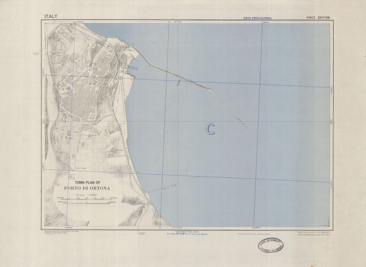
Two items printed during this period survive as originals: a 1:50,000 defence overprint of the countryside around Ortona, and a GSGS 4380 town plan at 1:5,000, titled Porto di Ortona. The defence overprint was a griblet, with known and suspected German positions printed on it in a second colour – all of which had been interpreted from air photographs. Depending on which one you held, the same farmhouse could have two or even three different grid references and, crucially, could have 500 yards of error baked into its margins.
As to the town plan? Well, GSGS had prepared some town plans for the Italian mainland, long before landing on it – but predictably, smaller coastal towns were drawn from old, Italian harbour charts. Corrections from aerial surveys were hit and miss – mostly miss – and this is as good a point as any, to point out this was a world-wide war, with only so many mapping resources. Town plans for small, coastal Italian towns were not high on anyone’s agenda. Besides, Ortona was a town under attack, and few plans survive that for long.
From the air, the Royal Canadian Air Force’s No. 417 Squadron; the RAF, and the South African Air Force all had at it. From the sea, the Royal Navy’s hurled 4.7-inch guns fired high-explosive shells weighing roughly 23 kg each, 10 to 12 rounds per minute per gun, onto the castello used by German observers as a primary artillery spotting tower, and into the northern outskirts of the town, targeting the coastal highways and secondary roads. On the ground, the attack into and through the town itself involved M4 Shermans of the Three Rivers Regiment; QF 6-pounders; No. 75 Hawkins Grenades & Teller Mines; Pak 50mm & Pak 40 75mm anti-tank Guns; turretless StuG IIIs ...
... and in that kind of attack, any town plan loses relevance quickly. But as we now know, the trouble started long before the Allies reached Ortona.
Some roads on the maps available – weren’t roads. For a start, while the road through S. Apollinare and S. Leonardo had been designated as the main Corps axis, a newly-constructed road from S. Vito Marina to Ortona followed the line of the coast more closely, but its completion was too recent to be shown on the maps available.
Moving up, as patrols neared the Moro’s south bank, three other routes had looked like good choices: a half-built highway near the river mouth; an old mule path passing Sant’Apollinare, dropping into the valley; a rutted inland track skirting farms around Rogatti. Each had pinched progress, with bad going reducing movement to guesswork. Still, that crossing had been forced, and San Leonardo was taken. The way north ought to have opened up then, towards the Cider Crossroads. Instead the land had simple fallen away into the Gully, and every push in any direction had found the same problem: German paratroopers, mines in vineyard rows, and machine guns set where they could rake the approaches. The weather had closed in, too. None of this helped.
What’s more, British grids offering references to mark a lack of progress didn’t agree from one map to the next. Rivers ran 100 metres from where they should and the rain – oh heavens, yes, the rain in Italy in the winter of 1943 – turned those 50-yard rivers into 300-yard wide torrents. The same roadside inn appeared again and again as ‘Osteria’ – not everyone spoke Italian and mis-transliteration was common - and a village called Villa Rogatti was Villa Roatti, or – on German maps pillaged en route – Villa Ruatti. Few editions agreed with each other. They had all been copied, badly.
At 1st Canadian Division HQ, sheets at 1:100,000 were doing the rounds – Sheet 141 of the GSGS 4164 series, CHIETI, showing Ortona town, and Sheet 147 – LANCIANO – showing the Moro, San Leonardo, and San Vito, looking as though they’d both been found in the bottom drawer of a very old library, not without cause. Finer details of the Gully weren’t on those sheets. If you’d been the officer examining Sheet 141-II-SE at 1:25,000 – ORTONA, from GSGS 4228 – or the Ortona 1:50,000 sheet from GSGS 4229, 141-II ... then you’d have discovered the boundary between them sits at exactly 42°20′ north. Ortona is about 2½ km north of that line. The Moro, San Leonardo and San Vito are south of it. The Gully and the lateral road lie roughly along the join, so you must use two maps to plan anything – and you just know, don’t you, that those map sheets don’t meet neatly, anywhere.
The Gully – that dip in the ground – was assumed to be a German defensive position. Few realised, from the maps, it would be too steep-sided for tanks, and impossible to get round easily under fire. On anything tactical, it had been reduced to a thin line – more an inconvenience than a decisive point in the landscape. Troops of 90th Panzer Grenadier Division and then 1st Parachute Division held it for the best part of a fortnight: and for the record, Germany’s mapping of Italy was based on – you guessed it – the same, old, Italian sheets at 1:50,000.
This is not the moment to talk about the Italian Military Geographical Institute, and its cooperation with Germany’s Department of War Maps and Surveys. There will be other moments to do that. This example of Italian maps, reproduced by Germany, puts much into perspective:


The Allies’ own sheets misled the Canadians. On any maps to hand, ‘Berardi’ looked like a hamlet – some reports even spoke of ‘street fighting in Berardi’ – but in reality, Casa Berardi was a large farm: a house, a few outbuildings, a dog, his bone, and very little else. Capt. Paul Triquet of the Royal 22e Régiment was awarded the Victoria Cross for his part in the fight for Berardi on 14 December, without the benefit of any maps. This isn’t pedantry. If you think you’re attacking a village, you plan for a village: its time, its troops, its fire. If you arrive to find a farmyard, or if the farmyard turns out to be a fortress, your plan of action is a fiction from start to finish.
RANGING. OR “HOW GUNNERS FIND OUT THE MAP LIED”
This is where bad maps truly stop being an inconvenience and start killing people. A gun doesn’t hit what it’s aimed at the first time, and gunners know that. The remedy is called ranging. Before a bombardment – in an ideal situation – guns fire a few shells at a point safely short of the enemy. An observer sees them land and radios back with adjustments – I’m making no apology here for describing this in simple terms.
Gunners make adjustments. They are good at doing this. Once the shells start landing where the map says they should, that becomes a fixed ‘control’. From there, a barrage can be lifted forward in calculated phases – it is a thing of wonder, when it works. Shells land further and further forwards, mere measured yards at a time, with the infantry following on behind... taking advantage of newly-churned ground as cover, ducking for cover from still-falling shrapnel, but making the most of gun-smoke (acrid) and chaos (acres of it).
Ranging, however, has two costs. It tells the enemy that an attack is imminent, and it needs someone who can see where the shells fall. By 1943 the Royal Artillery was also predicting fire: ideally in a moment of calm, it could calculate every gun’s aim from maps alone and open fire without a single ranging shot. The enemy gets no warning. The infantry get a barrage that is exactly as accurate as the map, and no more – and now consider what that meant, at Ortona.
The survey under the grid on Allied mapping dated from the late nineteenth century. It had never been properly updated since. In places, the large-scale sheet was just the 1:50,000 blown up to twice the size. The grid printed over it was mathematically perfect – but the hills, roads and gullies sitting underneath it all had various opinions about where or where they did not actually exist. As I said, errors of up to 500 metres were noted, here and elsewhere on the Italian mainland. A predicted barrage takes every one of those errors on trust.
Then add the weather. In mid-December, cloud sat low on the approach to Ortona; and anyone who’s spent time in Italy swatting mosquitoes knows that same cloud drops low to kiss the mists rising from any watercourse. Even if someone had wanted to check the fall of shot, observation was unreliable at best. Nobody could see where shells were landing, until they landed. In fairness, guns can drop short for other reasons: worn barrels, cold charges, the wind. Ranging exists to catch all of those too. At Ortona, that ranging checks might have prevented carnage – though again, simply ranging isn’t enough. The maps have to support the action.


MORNING GLORY
On 18 December 1943, the Canadians launched two attacks behind two fire plans, codenamed MORNING GLORY and ORANGE BLOSSOM. Flowers, both.
MORNING GLORY, supporting the 48th Highlanders of Canada, opened at 0800 hours with a deafening roar. It filled the air with the screams and sighing of passing shells and laid a wall of bursting high explosive 1,000 yards long and over 300 yards deep. The Highlanders went forward by compass, with the Sherman tanks of the Three Rivers Regiment grinding along beside them. Picture the gun lines while it went on – firing until the paint curled from the red hot steel and the men reeled in the pits from exhaustion and were sick from the blast – that’s not my imagination, it’s a quote from the historical record.
The Highlanders took their ridge, but the fire plan had already given the game away. What’s more, on the ground, the objective was 300 yards north of where it had been located on the map, which meant protective fire was falling on the objective rather than beyond it. Three hundred yards out, for the first barrage of the morning. The map was wrong, and nobody had fired a shot to find out beforehand.
ORANGE BLOSSOM
Shortly before midday the second barrage opened, carrying the Royal Canadian Regiment forward. In theory, ORANGE BLOSSOM was to have fallen parallel with the lateral road while the infantry used the railway track as an axis of advance. For the second time, the guns of 5 Corps opened fire. While the shells were still bursting on the opening line, 3 Canadian Infantry Brigade reported the rounds were falling short again – this time landing on the Carleton and York Regiment, despite the fact the Battalion had been withdrawn 300 yards from the edge of the gully.
Consider the words, ‘the opening line’. That is the line ranging would have fixed, the first line of the barrage, the one everything else is measured from. This time it was set from the map alone. It was wrong from the first salvo, and every lift forward was calculated from it. ‘Reported the rounds were falling short’ – is a war-diary voice, written for the footnotes of history. What it means is this. The Carleton and York Regiment had done the right thing. They had pulled back 300 yards from the edge of the Gully, the safety margin the plan asked for, and waited in their slit trenches for their own guns to clear the way. Then their own guns landed on them. The shells came in from behind, from the side they had every reason to trust.
A barrage lands as a wall of high explosive, not one shell at a time. Men who’d braced for the enemy found the ground erupting around them, churned up by shells shot by their own side. Through the smoke and flying earth a figure might loom up and vanish again before anyone could put a name to him. There was no cover facing the right way; every direction was the wrong way. Wounded men called for stretcher-bearers who had to cross the same ground to reach them. Officers screamed down dead or dying wireless sets to stop the guns, while the fire plan carried on against its issued timetable, because, dammit, that’s what fire plans are supposed to do.
Men died, and others would carry their injuries and that morning for the rest of their lives. ‘Falling short’ does not describe it. The guns were firing on grid references that didn’t match the ground, with no ranging to show it and no clear sky to see it. The first some knew of the error was when the screaming grew too loud.
LESSONS LEARNED, THE EXPENSIVE WAY
In the end, the Canadians took Ortona. They crossed the Gully, reached the town and cleared it house by house in the week before Christmas, knocking holes through party walls because the streets were death traps. That is a summary in a sentence. Read ‘The Savage Storm: The Battle for Italy, 1943’ by James for more details – I’ve included a list of useful books below, and will try to do that always, going forwards.
The 1st Canadian Infantry Division lost well over two thousand men ~ the press called it Little Stalingrad ~ and the Allied learned many lessons. Some of those included the fact that, still, four years into the war, too few understood how maps were made.
Moving forwards, field units in Italy started producing new 1:25,000 ‘key’ maps for the artillery: outlines of roads, rivers and landmarks, drawn from air photographs. An error of 50 metres was accepted as good enough, and fresh map sheets could be turned out in about four days. By the spring of 1944, at Cassino, gunners were working with brand new 1:25,000 sheets; the German defences was overprinted in red, and artillery targets were overprinted in violet. Some still carried a warning in the margin: NOT TO BE USED FOR ARTILLERY FIXATION. It’s hard to read that without thinking of December 1943.
It is also tempting to file what happened in the advance to Ortona under ‘friction’, the gritty get-out clause, Clausewitz insisted be inserted in every textbook. To my mind, the events here are an example of history getting the better of geography. Historic surveys informed current mapping; map sheets missed roads nobody had thought to draw; rivers and ravines were misunderstood in more than one dimension; place names were added in error; features existed or did not exist where nobody had thought to map or map-out a plan; buildings were dressed as villages, and a grid sat over a survey that was three times the age of men trusting it with their lives.
And you thought the battle for Ortona was all about mouseholing.
James Holland, The Savage Storm: The Battle for Italy 1943 (2023). This covers the campaign from the Salerno landings in September to the end of Ortona in December. It’s good on the wider Eighth Army picture and the German side. (Follow it up with Italy’s Sorrow about 1944–45.)
Mark Zuehlke, Ortona: Canada’s Epic World War II Battle (1999, with several later editions). An account built on interviews with veterans. It follows the fighting from the Moro through the Gully to the house-to-house battle in the town.
Daniel G. Dancocks, The D-Day Dodgers: The Canadians in Italy, 1943–1945 (1991). A lively history of the whole Canadian campaign in Italy, told largely in the soldiers’ own words.
Farley Mowat, And No Birds Sang (1979). The memoir mentioned by James in this week’s podcast episodes, written by a junior officer serving with the Hastings and Prince Edward Regiment. It covers the Moro and the approach to Ortona, and is one of the great Canadian war memoirs.
Marco Patricelli, La Stalingrado d’Italia: Ortona 1943, una battaglia dimenticata (UTET, 2002). The main Italian history of the battle, including what it did to the town and its people.
Andrea Di Marco, Assolutamente resistere (Menabò, 2013). The battle from the German side, drawn from war diaries and soldiers’ testimony. Di Marco also tries to identify the Germans who died there.
Canadian Military HQ Report No. 165. Do have a look at the Historical Section’s account. It’s free on the Canada.ca site, though you’ll have to download it in parts.
Finally - here’s the link to those We Have Ways pod episodes.
If you’re not listening to it, why not?
Fascinating Merryn. Jim and Al did a good job of telling the story. I had heard elsewhere (YouTube I think) of the Canadian participation in the action; grim. It’s a battle, indeed the entire Italian campaign, that deserves a wider audience outside the IC. I had a Scots-Italian colleague who told me about the bewildering variety of dialects that often rendered one valley incomprehensible to the next. I may have mentioned this before, if so forgive me. I vaguely recall reading about map reading difficulties US advisors experienced in newly independent South Vietnam. Apparently the French had used a zero meridian that went through Paris rather than Greenwich. Happy to be corrected.