
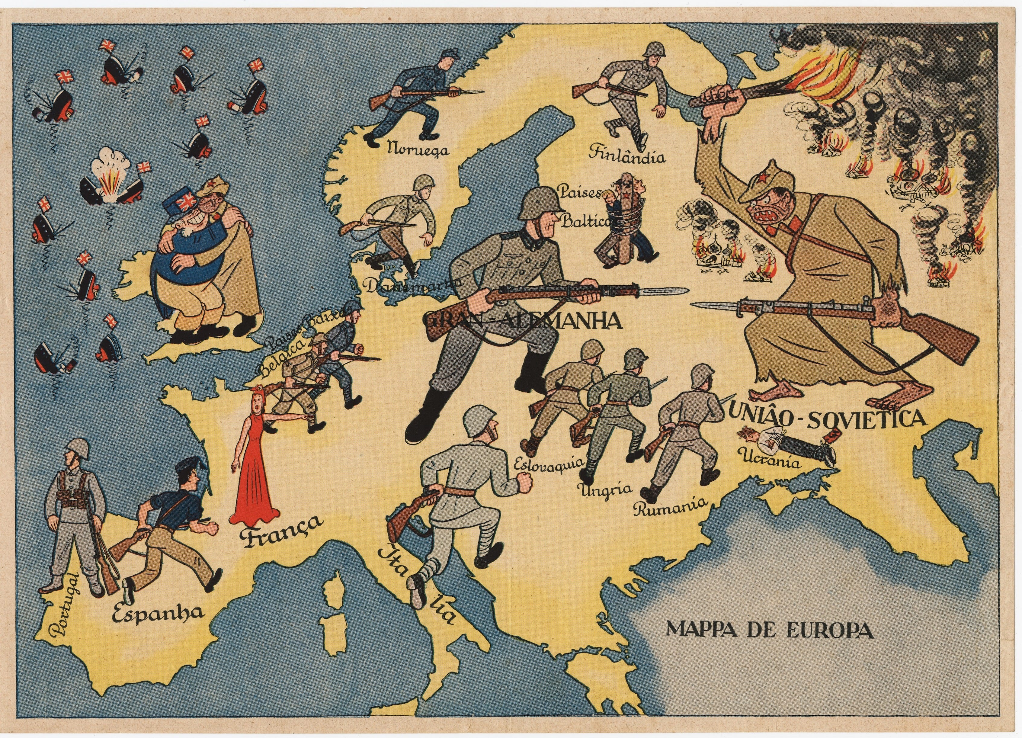
Maps are a weapon – a powerful weapon – because maps look, simply, like facts. A map says, ‘this is how things are’, and a mapmaker can change the world... so it’s no surprise, mapping had its run as a propaganda tool during the Second World War.
Our main map in this article, for example, begs the question: is it a propaganda map of Portugal or a Portuguese propaganda map? The two are very different, and between 1939 and 1945 the difference mattered. A Portuguese propaganda map was one made by Portugal, for Portuguese purposes. A propaganda map of Portugal – or, more often, one dressed up in Portuguese – was made by someone else entirely, and slipped under Lisbon’s door. Portugal was neutral, you see, which made it one of the few places left in Europe where both sides could still advertise their intentions: British and German propagandists worked the same streets targeting the same people, each assuring the Portuguese that the other lot were dastardly fellows.
A map was ideal for this. There’s a snag though, in this propaganda metier, and it’s worth keeping at the back of our minds as we admire the pretty pictures; no matter how good the mapmaking, the actual map can only informa and persuade a person who’s able to read it.
THIS IS NOT A SMALL COUNTRY
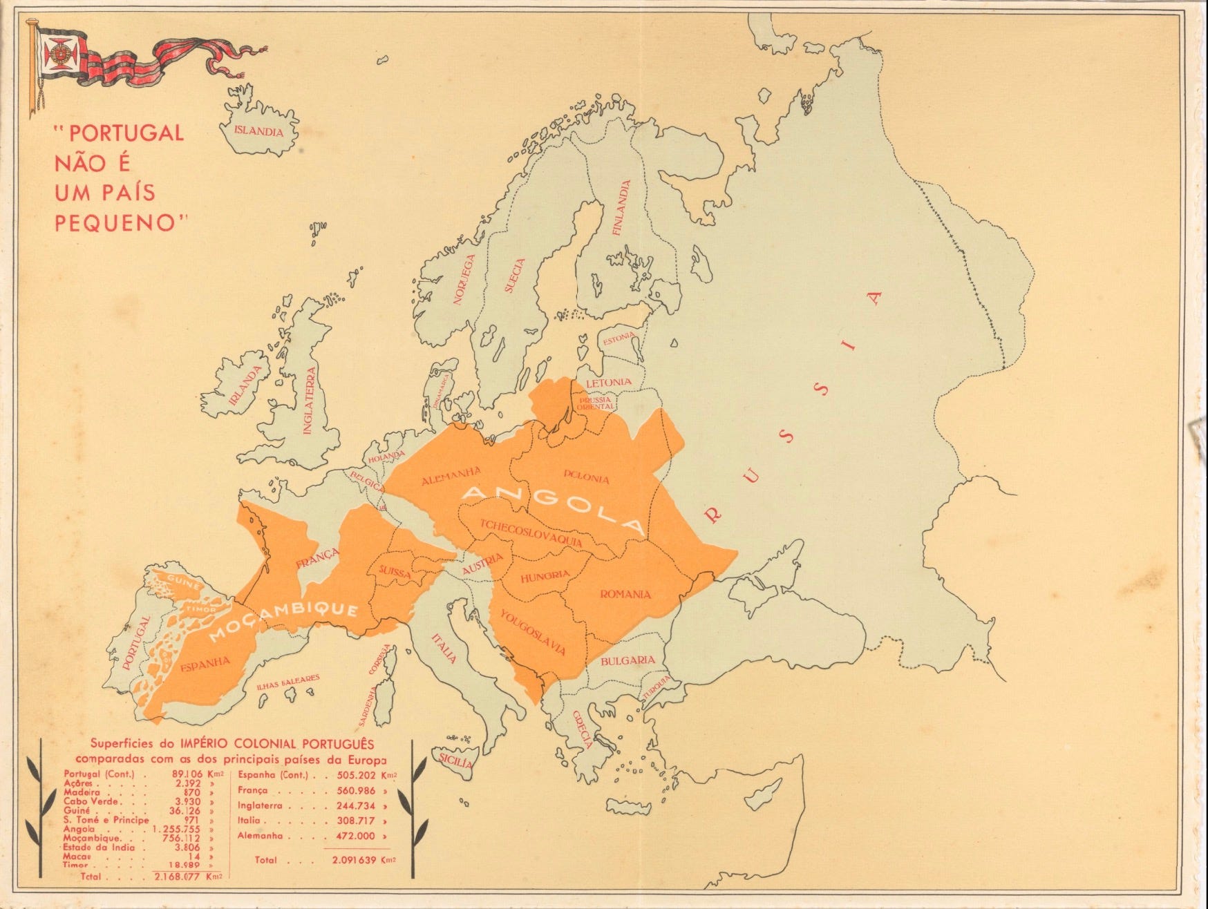
Let’s start with the real thing. Portugal não é um país pequeno – ‘Portugal is not a small country’ – was produced in 1934 by Henrique Galvão, an army officer and colonial administrator, for the First Portuguese Colonial Exhibition in Porto; an exhibition he also happened to be directing, which does rather simplify the commissioning process somewhat. The map was printed by Litografia Nacional, of Porto, and uses a simple trick that’s mirrored today by online whizzymajigs. thetruesize.com is one such.
Take Angola, Mozambique and the rest of the empire; colour them brightly; and lay them down, right across Europe, as if you’re floofing a blanket. Add a table of figures proving that Portugal and its colonies, together, outsize Spain, France, England, Italy and Germany combined. Small country? Certainly not, mon ami. Just badly folded.
This map worked so well, Salazar’s regime reprinted it for decades: postcards in Portuguese for home consumption; French and English versions for visitors; and - by 1951 - an edition from the Secretariado da Propaganda Nacional laid the whole lot over the United States instead – for the benefit of American tourists, who presumably needed a unit of measurement they could relate to. People ask where Brazil has gone. Independent since 1822, I’m afraid – a century too late to help with the arithmetic.
Galvão himself deserves more than a footnote. Post-war, in 1947, he reported on forced labour in those same colonies, concluding only the dead were truly exempt; he fell out with Salazar, was arrested in 1952, escaped – and in 1961 hijacked a liner, the Santa Maria, to make his point. Not many mapmakers manage a second act like that.
THE MAP NOBODY SIGNED
Back to the map at the top. Mappa de Europa carries no date, no artist, no publisher and no place of printing – which is exactly what you’d expect from someone proud of their work. Its message is anything but subtle. The Soviet Union is a ragged, barefoot brute – burning churches, torching farms, enslaving Ukraine and the Baltic states – and its only friend is Britain, drawn as a stout and faintly sinister gentleman whose ships are busy sinking.
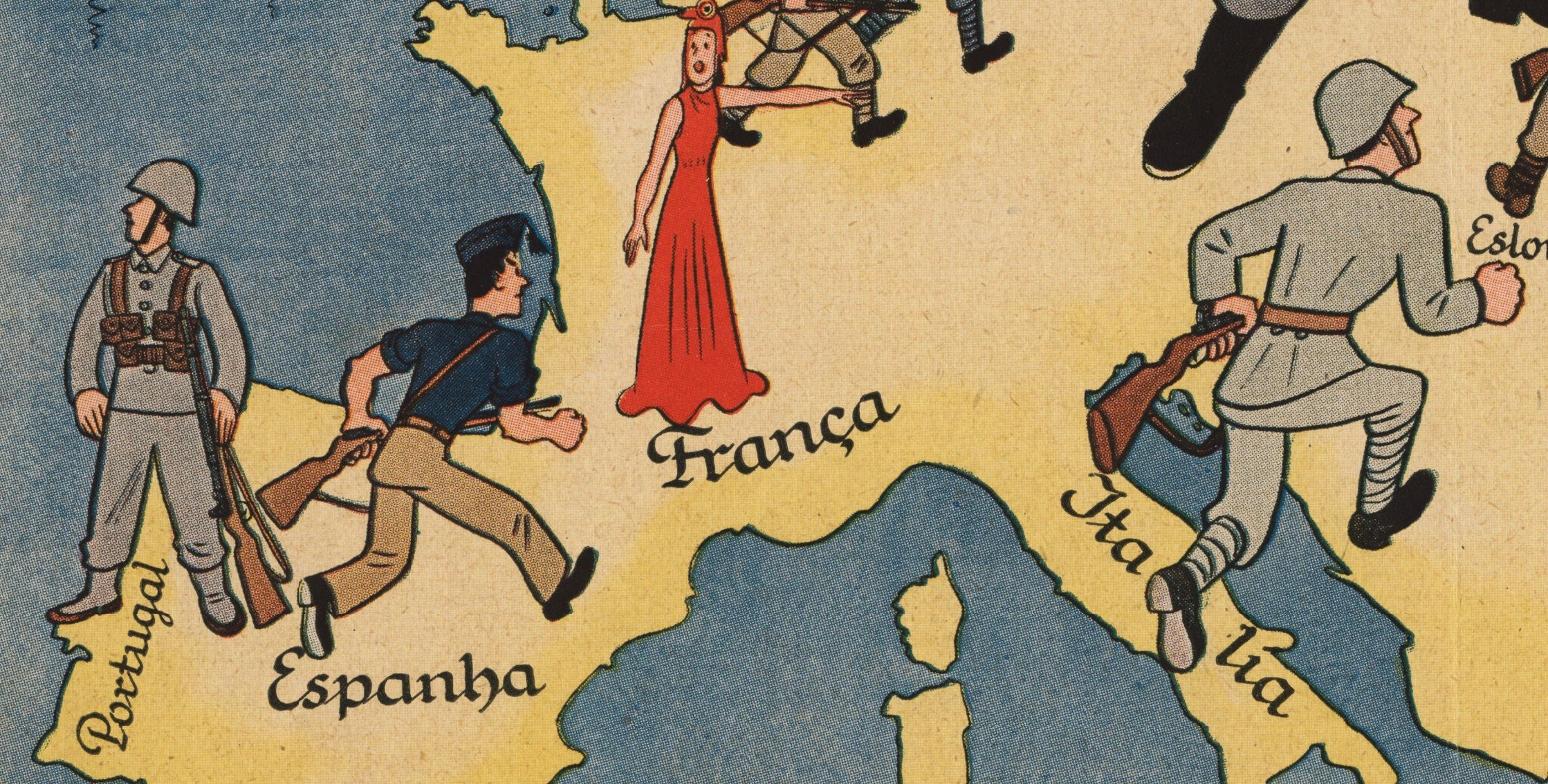
Against them stands Germany: clean-shaven, well-dressed, and joined by soldiers from Spain, France, Belgium, the Netherlands, Denmark, Norway, Finland, Italy, Czechoslovakia, Hungary and Romania. Those, for the record, were volunteer brigades of the SS rather than the defeated governments of half a continent – but the map isn’t minded to explain that. And Portugal? Portugal’s soldier has turned his back on the whole business, and is gazing out at the Atlantic. The events shown put the date at about 1942.
There are two schools of thought around this map’s origins. One says it appeared first in Lisbon: this is Salazar’s balancing act on paper, protecting the ancient alliance with England without cosying up to Berlin. The other says it was drawn in printed in Berlin, as a nudge for the Portuguese to stop staring out to sea and join in on a merry crusade. So, who made this map?
For me, it’s the spelling that makes things clearer. No native Portuguese speaker in 1942 would have written mappa with a double ‘p’ – Portugal’s spelling reform of 1911 had seen to that. Accents are missing from Italia, Eslovaquia and Paises Balticos. Hungary has lost its H altogether to become ‘Ungria’, and Denmark appears as ‘Danemarka’, which is how nobody in Lisbon – or Rio, come to that – has ever spelled it, no matter how many pints of Porto they’ve consumed.
In fairness, a Brazilian national would have written Mappa da Europa, not de Europa, so the grammar is Portuguese even where the spelling isn’t. It’s either a Portuguese map with oddly archaic spelling, or a foreigner’s map with a phrasebook.
But then there’s the drawing, itself. The illustrative style is pure Franco-Belgian comic strip – very much à la Tintin – and Hergé himself spent the occupation drawing for a German-controlled newspaper in Brussels; he wasn’t the only illustrator of that school to do so. Add the label ‘Greater Germany’ – the Nazis’ own name for their enlarged Reich – and this looks rather less like a Portuguese map, than a map wearing a Portuguese hat.
IS ENGLAND IN TROUBLE? YES! (DO MAKE UP YOUR OWN MIND)
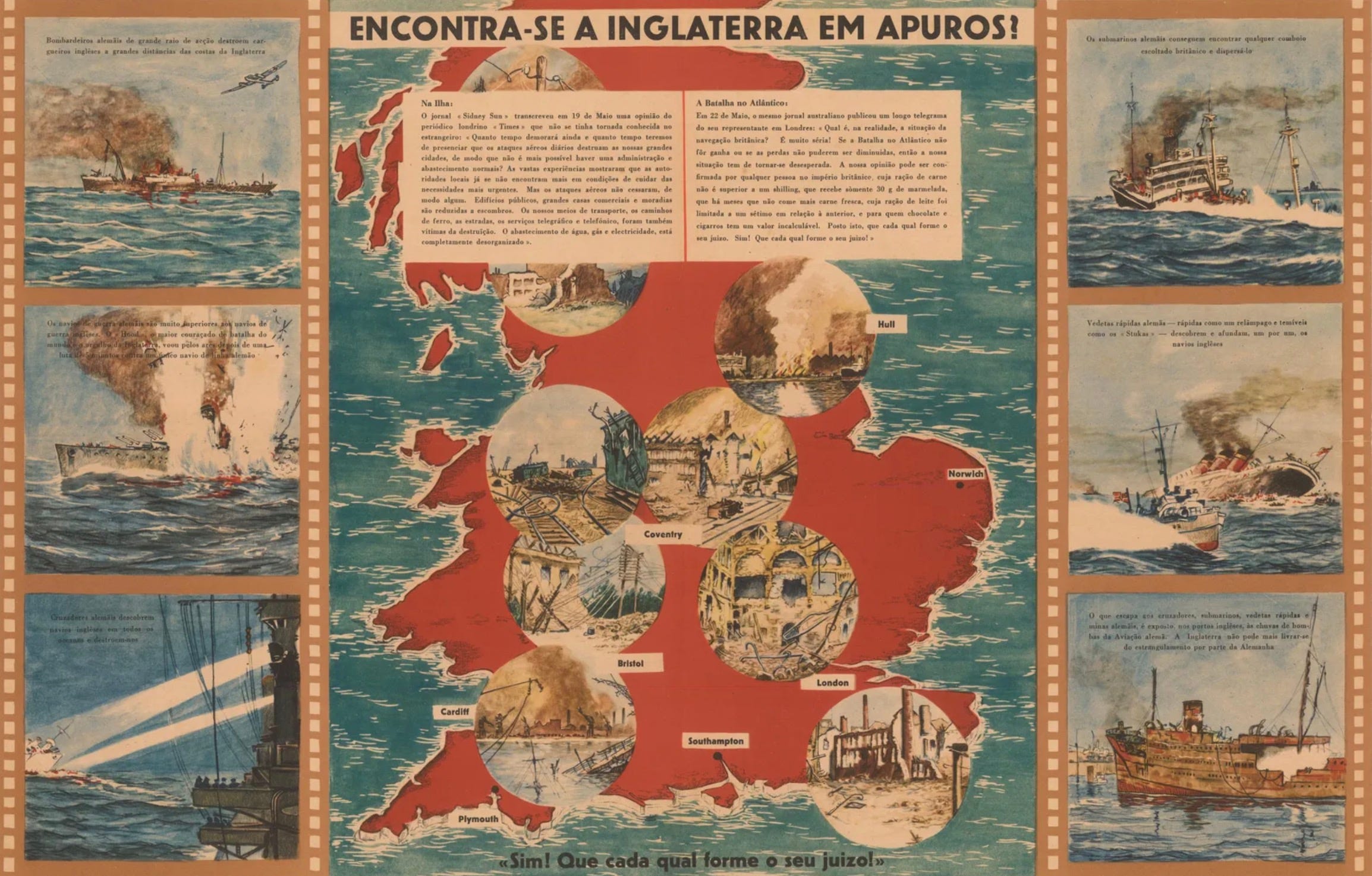
The second anonymous offering is less coy about what’s what, and which side it’s on. Encontra-se a Inglaterra em apuros? Sim! Que cada qual forme o seu juízo! translates as ‘Is England in trouble? Yes! Let everyone make his own decision!’ – a question, followed by a nuance answer, from a sheet that’s already made up its mind. Britain sits in the middle, almost hidden under bomb damage: London, Southampton, Plymouth, Cardiff, Bristol, Coventry, Norwich and Kingston-upon-Hull. Also known as ‘Ull.
Around the edge run six panels dressed up as frames from a reel of film – British ships going down to U-boats; to aircraft; to surface raiders – and two long quotations describing the general state of affairs in Britain: food running out, a government failing and citizens in a mad, mass panic. Those views are credited to the Sydney Sun, quoting The Times of London... a chain of custody that ought to trouble any editor.
On the date? Experts disagree. Cornell University has this map stored with a label saying printed in 1941, and suspects Nazi sympathisers working inside Portugal; The Map House in London has it appearing more loosely in 1943, and blames the Axis propaganda machine directly. What nobody suggests, is that Salazar’s government printed it. This is a map of Britain, written in Portuguese, made by Germany’s friends – not a Portuguese propaganda map, nor even a propaganda map of Portugal, but a propaganda map for Portugal.
Do keep up.
LONDON REPLIES, LISBON LAUGHS
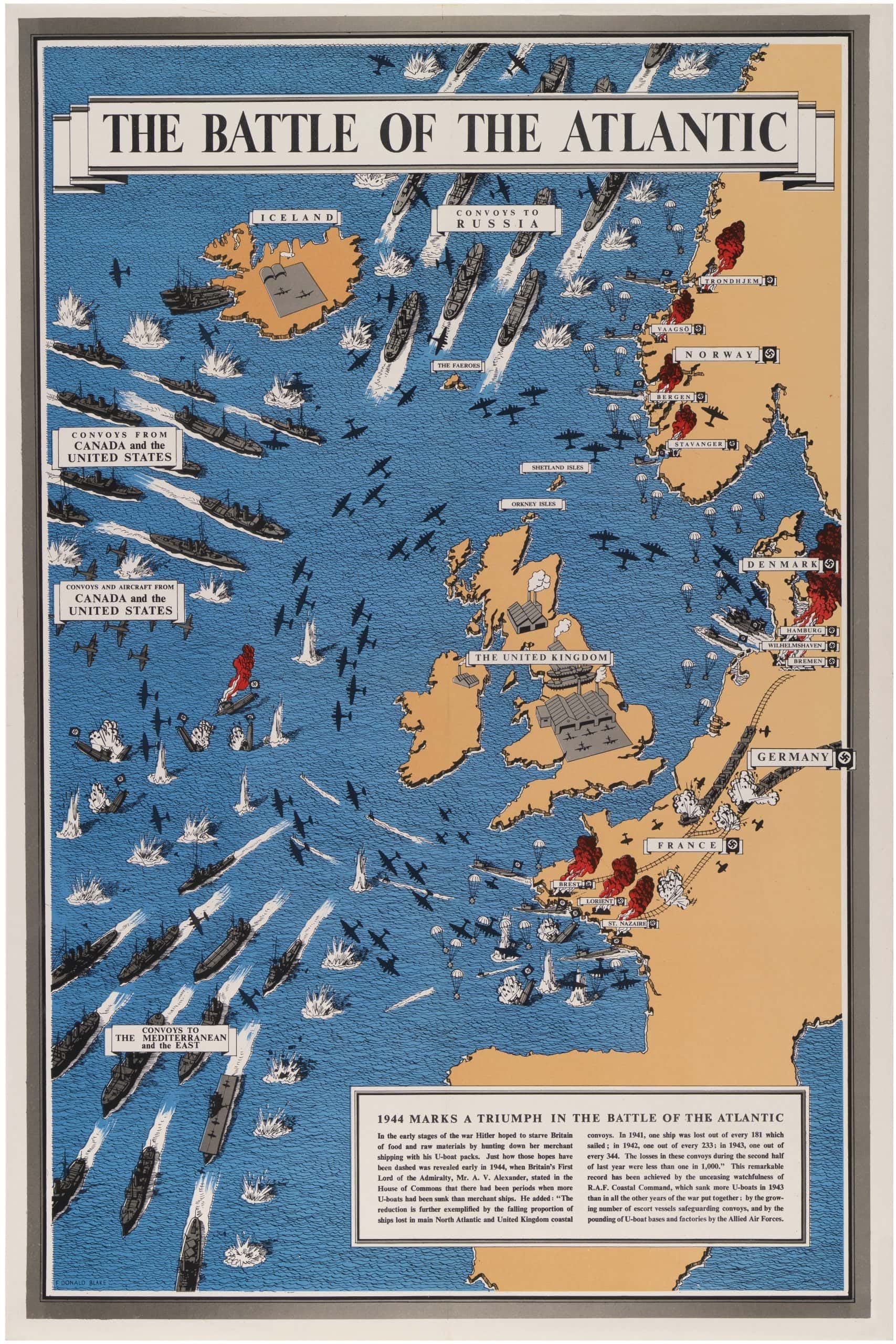
The British weren’t going to let this stand. In 1943 the Ministry of Information issued The Battle of the Atlantic: a pictorial map by Frederick Donald Blake – Greenock-born, Camberwell-trained, and also found drawing war maps for the Daily Express. Convoys steam east under escort; bombers pound the U-boat pens at Lorient and St Nazaire; everything is going splendidly. It was printed in English, French, Dutch, Arabic – and Portuguese. Same ocean as the German sheet, with the same ships, but a rather different message. Meanwhile, the Portuguese were drawing maps of their own, and these are the ones I like best.
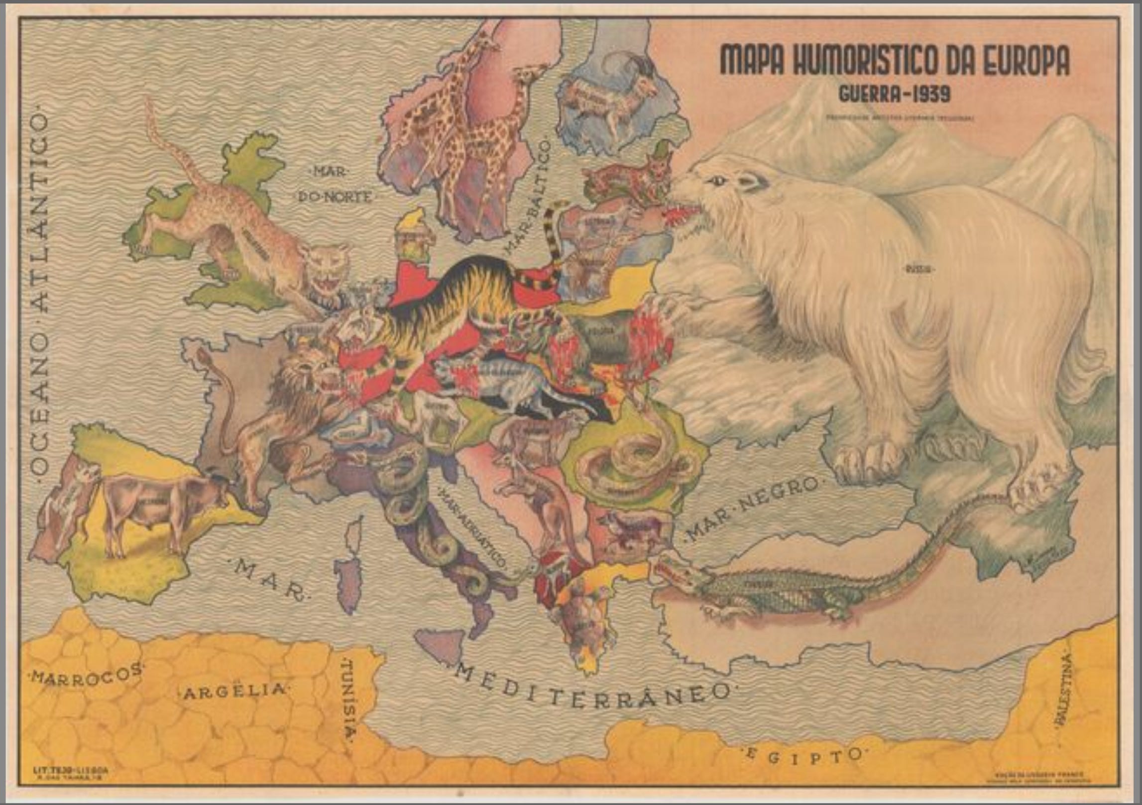
António Soares – a modernist painter who took a Grand Prix at the Paris Exposition of 1937 – dusted off an animal map he’d drawn for the First World War, and updated it for Livraria Franco, a Lisbon bookseller, in 1939. Germany is a tiger; Russia a polar bear; France a lion; Switzerland a lamb. Portugal is a white dog baring its teeth – a bold little bit of anthropomorphisation, for a neutral country.
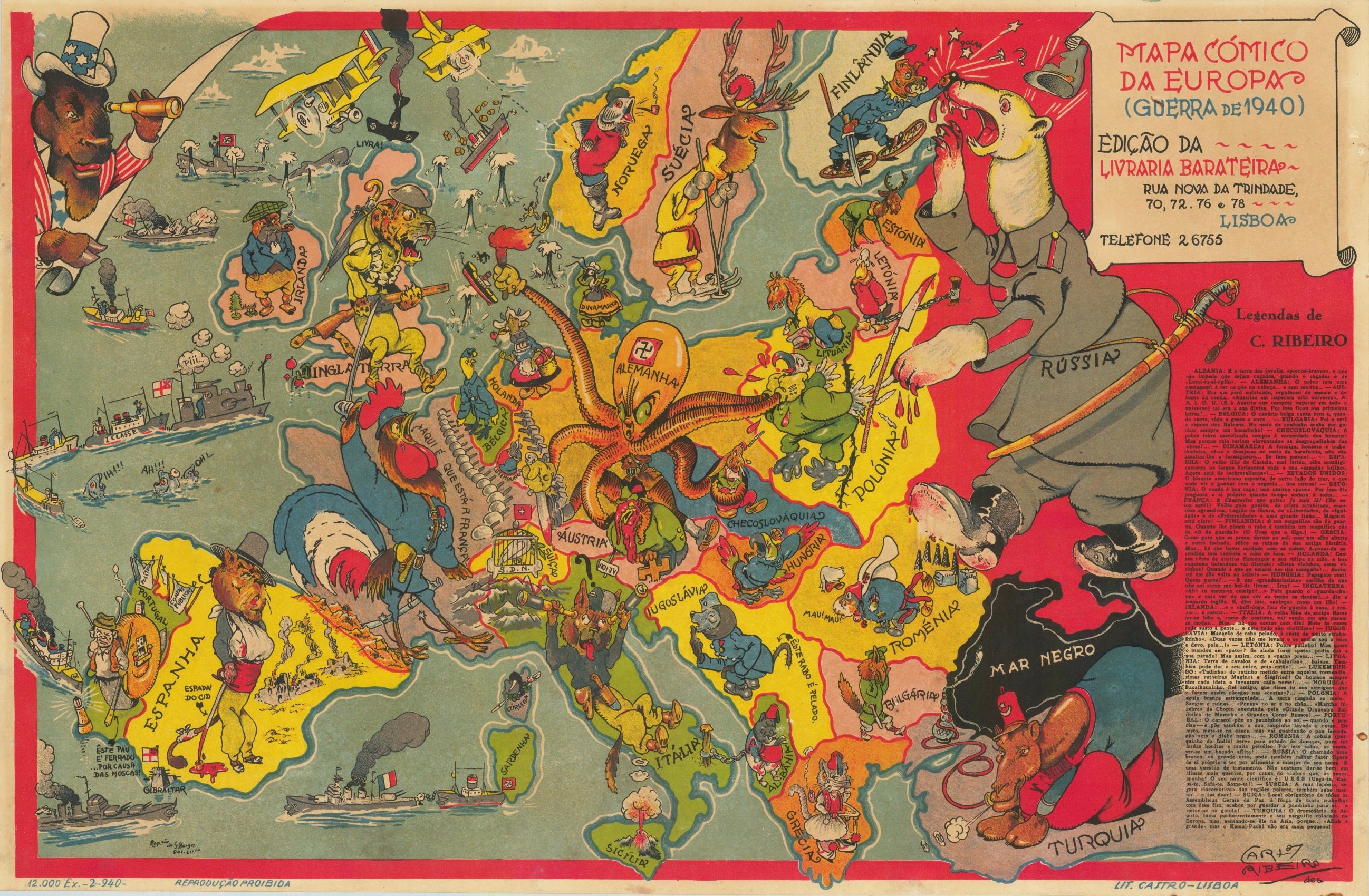
Carlos Ribeiro’s map of 1940, for Livraria Barateira, is far less flattering. Germany is an octopus, throttling Poland. Switzerland is a dove in a cage. Portugal is a snail.
Neither is a map purporting to be state propaganda – they were sold in bookshops, to people who fancied a laugh. But they are Portuguese maps, not afraid to state their makers’ personal points of view, and that’s more than can be said for the anonymous items being printed elsewhere.
YES, BUT DID ANY OF THESE MAPS WORK?
The troubleis, to be moved ~ or influenced, at least ~ by Mappa de Europa, you must first know which blob is Ukraine, where the Baltic is, and that the small rectangle on the far left with its back turned is you. In the early 1940s, that’s still asking a good deal of Joe Public, Zé Povinho, or indeed, José Público.
Portugal’s census of 1930 classed roughly six of its own people in ten as illiterate. By the early 1940s, the regime was celebrating the fact that – for the first time in the country’s history – a bare majority could read and write. Reading a map is something else. Plenty of people who could manage a newspaper headline still couldn’t draw an outline of Europe, let alone pick out Kingston upon ‘Ull.
I suspect the propagandists knew this – which is why these maps are barely maps at all. Take the geography away and the pictures still work: the barefoot brute is easy to understand, as is the burning church, the sinking ship, and the soldier with the good jaw. The map is there to lend authority; the cartoon does the persuading. You don’t need to find Coventry on a map, to understand a drawing of it on fire.
And the result? Well, as we now know, Portugal stayed neutral right ‘til the end. It granted the Allies permission to set up a base in the Azores in 1943 ~ was rightly miffed about what happened on Portuguese Timor in 1942, and THAT’S an article still to come ~ and joined nobody else’s crusade in the interim.
Whether any of that owes a thing to a film-strip of sinking freighters, or a snail drawn for a Lisbon bookshop, is doubtful. Salazar read the other sort of map – the sort that showed where the armies actually were – and drew his own conclusions. Which rather leaves these propaganda maps doing what they do best, eight decades on: looking marvellous on a wall, and telling us rather more about the people who made them than the people they were aimed at.
Zé Público, one suspects, peered at these maps and went back to his pastel de nata.
All credit due, as always, to the purveyors of fine mapping such as this ~ including Barry Ruderman, Curtis Wright, Geographicus, et al.