
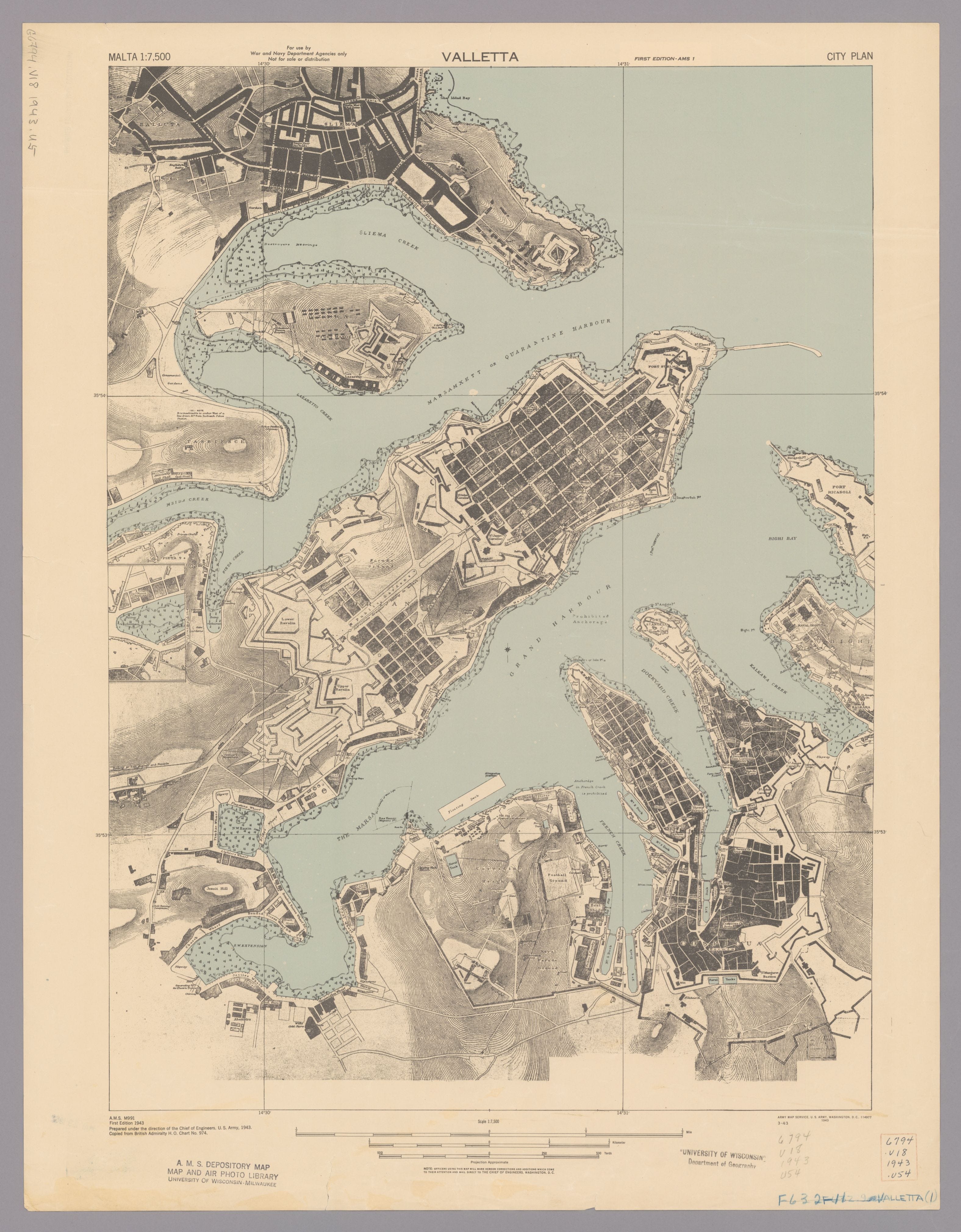
I like this map of Valletta, which was first published in 1943 — or so the caption says.
But what draws my eye most isn’t the orderly grid inside the city walls — houses and streets dating back to the mid 1500s, laid out in obedient lines. No, it’s the rectangle: a small blank space on the waterfront below the Marsa, where the harbour narrows toward French Creek. It’s labelled ‘Floating Dock’.
Before I get to that though, the map sheet it’s sitting on deserves a word, because the word ‘map’ itself should raise a few eyebrows.
Technically, this is City Plan, MALTA 1:7,500, First Edition. Prepared, as was usual, by an un-named draughtsman working under the direction of the Chief of Engineers, U.S. Army, in 1943 – and copied from the British Admiralty’s Chart No. 974. One sheet of paper, three separate ways of getting dressed for the same event: the Admiralty’s hydrographers called their version a chart, because it was meant to keep a ship off the rocks; the U.S. Army Map Service called their tracing a plan, because it was meant to move a soldier round the city without getting shot; and I’m calling it a map, because that’s how most of us see pieces of paper like this one — eighty-five years after the fact, it seems churlish to call it anything else.
*Surveyors have opinions about this: a map orients you, a plan lets you build something, and a chart is a tool on which somebody’s safety depends, usually while you’re afloat.
Back to those two words on this map of Valletta, though.
A floating dock, unlike most things worth putting on a plan, doesn’t have one address. It’s a colossal steel box, built to be flooded down, walked out from under a ship, towed to wherever the work is, and pumped dry again wherever it lands. And depending on which creek had the cranes free or the depth a particular repair needed, Malta’s dock sat in more than one regular spot. So whoever surveyed it first for the Admiralty’s contribution to charting collateral didn’t just commit to a single rectangle — they added a note, in effect: if it isn’t here, try over there.
A small piece of honesty, but I like it. A lot. It’s an official aside, that the thing being mapped simply might not be where it was supposed to be. Except — that note can only be true of a dock that still moves, and by the time this particular sheet went to print, Malta’s didn’t.
Malta had no floating dock at all until 1925. Before that — for a naval base with what the Victorians liked to call ‘incomparable harbour facilities’ — there was nowhere to lift newer, larger warships clean out of the water for repair. On 17 July, the tugs finally towed the appropriate piece of infrastructure into Grand Harbour: Admiralty Floating Dock No. 8, a German-built piece of engineering handed to Britain as war reparations — one empire’s reparations bill turned into another empire’s dry dock. It did the job for fifteen years, presumably drifting between its usual berth and its alternative one as required, without anyone thinking to remark on it.
Then, on 20 June 1940, ten days into Italy’s war against Britain, Italian bombers hit it twenty-four times and it sank where it stood.
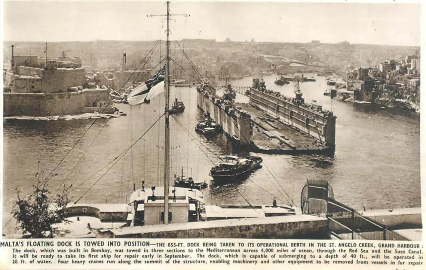
The floating dock didn’t drift anywhere after that. It stayed where it went down for twelve years, until the port authorities finally brought in an Italian floating crane to raise the wreck for scrap. Malta had no floating dock of its own for the rest of the war, and three years past it — which means that by 1943, ‘Alternative position’ had stopped being a useful note and, unintentionally, become a kind of fossil: an artefact from whichever earlier edition of Chart No. 974 had first recorded the dock’s two working berths, copied faithfully onto a wartime plan by people who had no reason to know it no longer applied.
The dock wasn’t at either position. It wasn’t floating at all. It was sitting, in a single, entirely un-alternative position, on the bottom of the harbour, and would go on sitting there for another nine years. It still makes me smile, though. A note meant to capture a moving object’s one flexibility — it might be here, or it might be there — outlived the thing it was describing, and was then reprinted, in good faith, years after both positions had become equally wrong.
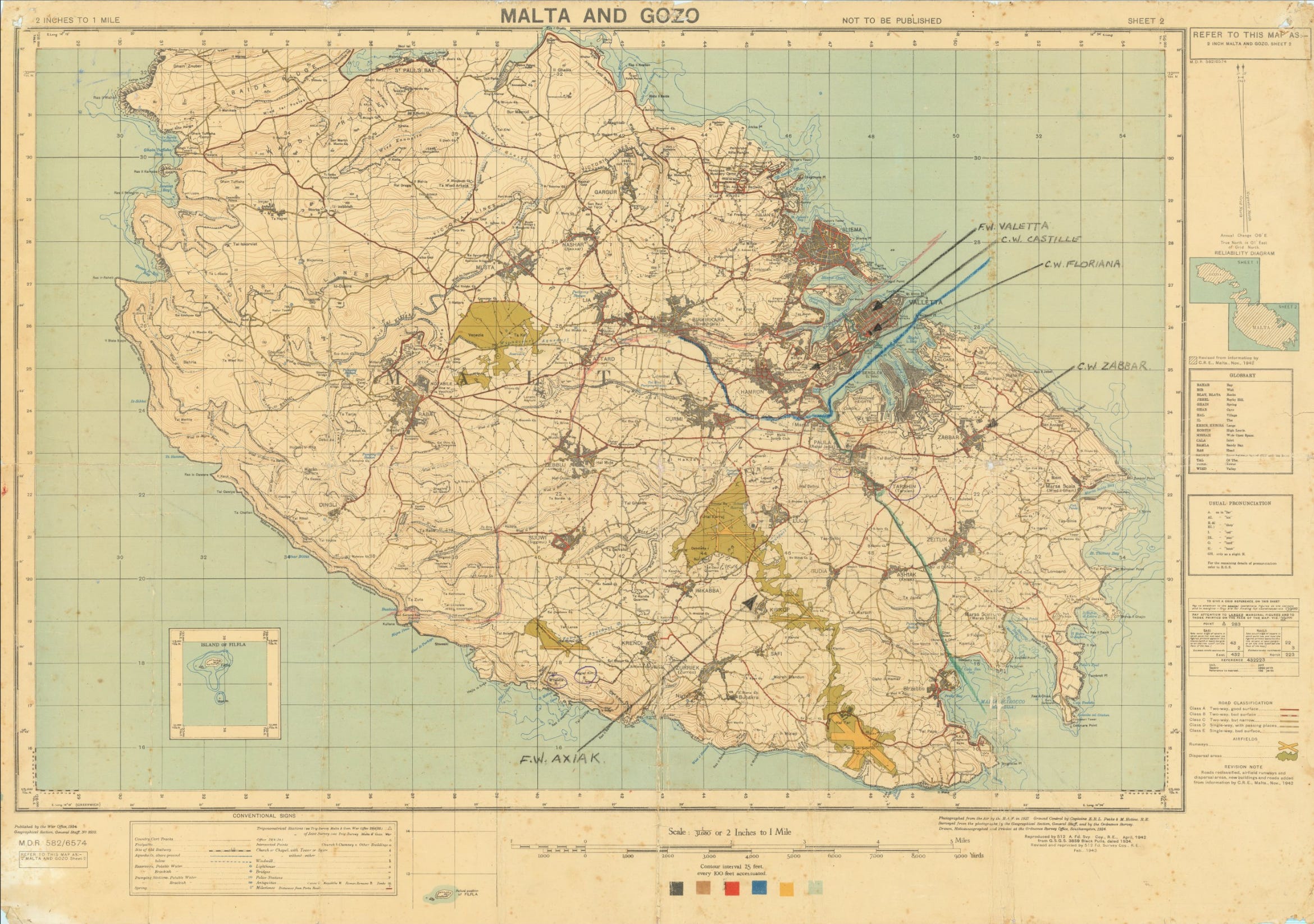
For kicks, by the way, here’s GSGS 3859 showing Malta. To zoom in, pop over to Barry Rudderman’s site - smashing chap, awesome map collection.
The most peculiar thing about maps, is that once printed, they’re always out of date. In wartime, doubly so. A factory might be razed to the ground the day after ink hit paper; a track might have become a road due to heavy traffic; a bridge might no longer ford a river, and a dam might have been blown to smithereens. That map of Valletta was, technically, trying to be twice as careful as it needed to be, to be accurate for those about to use it. Still wrong, as it tried so hard to be right.
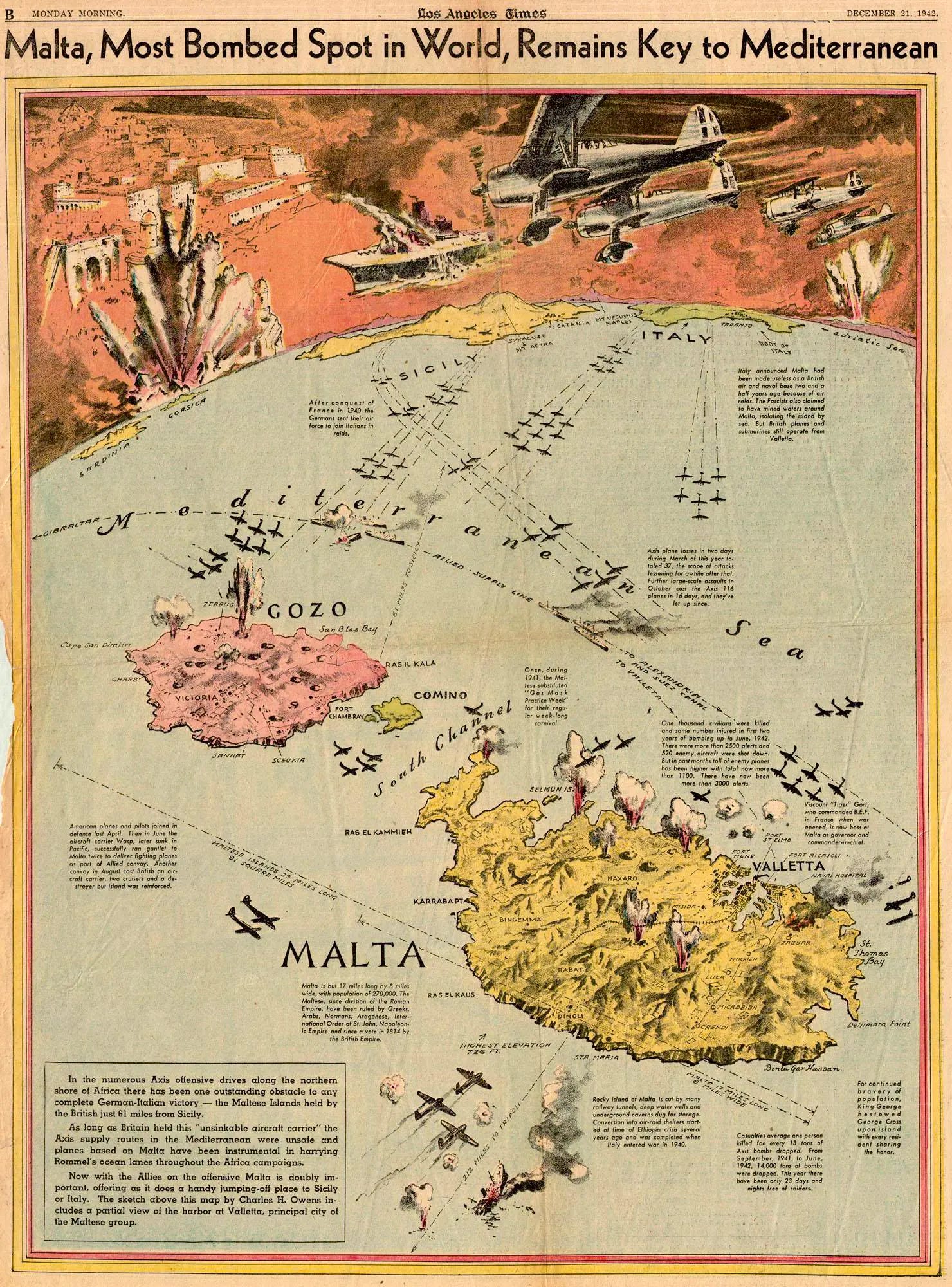
An added bonus: here’s a super example that shows how easy mapmakers of all kinds could get things wrong: an illustration for the Los Angeles Times in 1942, depicting the bombing of Malta. The eagle-eyed among you will note the mapmaker has Axis aircraft attacking from the southwest, which rather skews the footnotes of history.
Amazing, isn’t it, what you reveal in history when you study a bit of geography.