
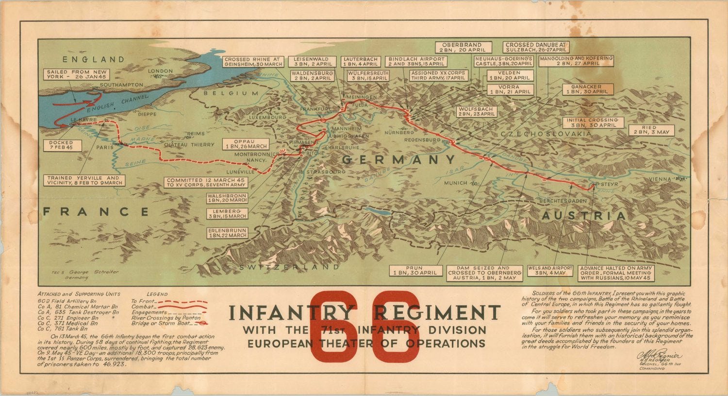
We revere the poetry of the Second World War and classify it as literature, so why don’t we give more time to campaign maps ~ and see them as works of art?
I’ve walked a fair bit of ground in my time. Boots on, map sheet in hand, fingers following contours ~ trying to see the slope the way a section commander might have seen it at first light, and not fall down that same slope. But then comes the other part ~ the pensive part of mapping history in your mind’s eye; when the mud on your boots has dried, and the grid references have settled, and what you really want is a reminder of the whole darned thing at once.
That’s when a campaign map comes into its own. It doesn’t do contours. It hands you an entire calendar of movements and battles and experiences as a snapshot ~ every stop, every date, every detour ~ drawn by someone who’d walked the ground too, only rather less voluntarily. They truly are, a work of bloody art.
ALL MAPPED OUT
This week I’ve posted a couple of campaign maps on socials ~ nothing clever ~ and people liked them. Reposted them, even. More, if I’m honest, than they tend to with a perfectly good topographic map, which pains me greatly. But it set me thinking.
And then yesterday, serendipity slipped a town plan of Bremen across my desk, and that thinking turned to two campaign maps of more or less the same place at more or less the same moment in time ~ which couldn’t be more different if they tried. One is the official campaign map chronicling the war for the 52nd (Lowland) Division; and the other is the ~ dare I say it, quite rudimentary? ~ simple campaign map that traces the route of 155 Infantry Brigade’s headquarters. That’s Peter’s brigade.
I’m privileged to have walked the ground in the company of the expert on Captain Peter White, 10 Platoon, 4th Battalion, The King’s Own Scottish Borderers, and of the 52 (Lowland) Division in general. Andy Aitcheson. As a battlefield guide, walking the ground, you do get to do some hoopy stuff. Together, we’ve literally followed in the footsteps of the Jocks, dipping in and out of the dotted lines that track the Scots’ progress across these maps. But it’s 155 Brigade’s work of art that I turn to first, to remind myself that Mantfelde came before Heiligenfeld (or Heiligenfelde, as P. Todd has it ~ one of us has an ‘e’ too many) ~ and the Roer triangle was a mess.
THE COMPLEX CAMPAIGN
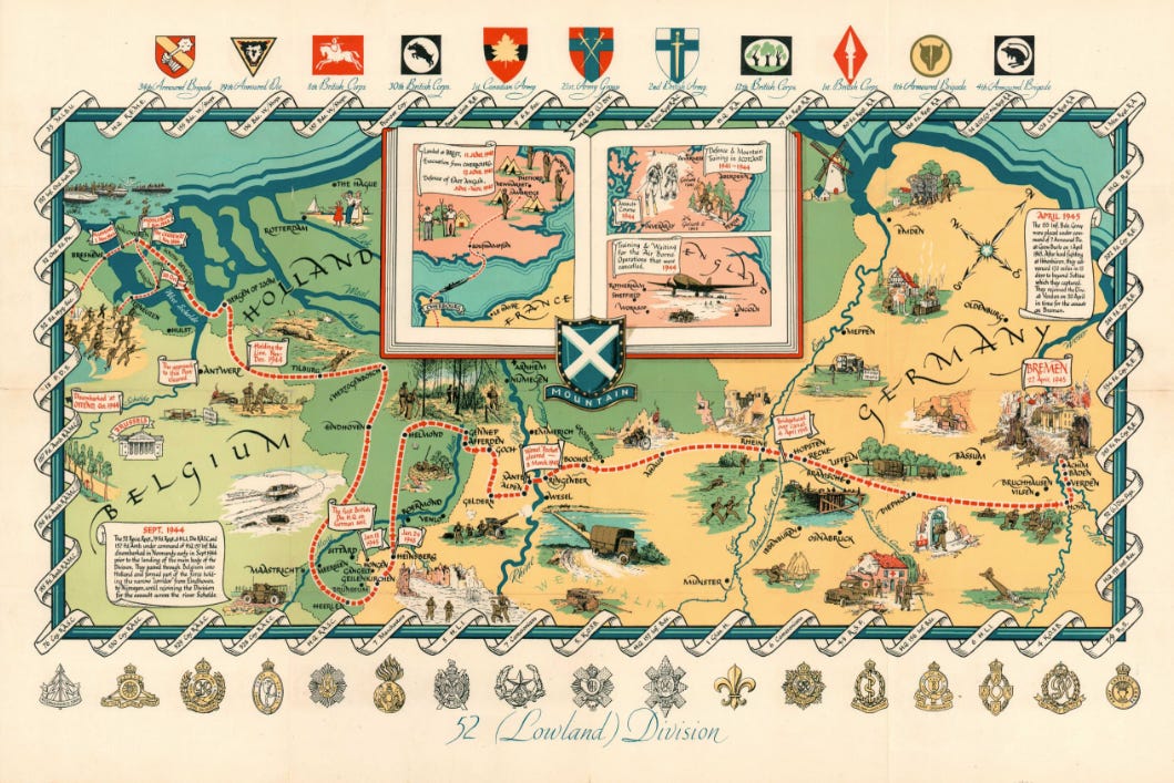
So let’s start with the grand mapping. The 52nd (Lowland) Division’s map of its war is a magnificent thing ~ some thirty inches across ~ and it means business. Northern Europe sprawls across it, studded with pictures of the division’s engagements as a soldier might remember them, and the whole thing is framed by the names of its units and the badges of every corps, brigade and army it served under.
The awkward bits are handled tactfully: the division’s ignominious days in France in 1940, and the long years of training and waiting at home, are tucked away in a small box in the middle, so as not to spoil the view. It was first drawn in 1945, and its design was later used for the cover of George Blake’s history of the division, Mountain and Flood (Glasgow, 1950). It’s a delight to look at, it’s a useful resource, it’s pleasing, it’s human, and that’s all fine and dandy. It’s also, quite plainly, the division’s own version of events: badged, bordered and, one suspects, approved.
THE SIMPLE STORY
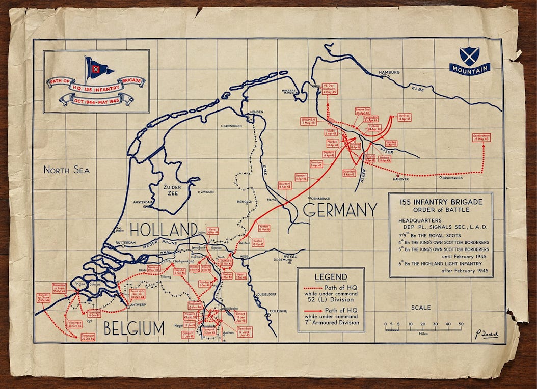
The details on this map trace the progress of H.Q., 155 Infantry Brigade, from October 1944 through to May 1945. The 4th KOSB are there in its order of battle, alongside the 7/9th Royal Scots, the 5th KOSB (until February 1945) and the 6th HLI (after it). As a brigade of the 52nd (Lowland) Division, we can follow 155 from its landing at Ostend, up to Breskens and Flushing for Walcheren, then across Holland and into Germany.
There are no rules about what goes on a map like this. Or rather, rules get created on the fly: it shows where men put their boots on to travel who knew where. Often the caricature of what happened next appears as cartoons ~ iconic buildings, tiny figures, and tanks no larger than a fingerprint. This one doesn’t go that far. A pennant, two scrolls, the divisional shield with its Mountain tab, and that’s your lot. But there’s no doubt, it’s a map drawn for rapid reflection, rather than the war record.
But stand in front of it for a minute, the way you would a painting, and consider how it’s made. Two inks. Only two: blue for land, rivers and the grid, red for the brigade. The country names are in tall outline capitals, HOLLAND, BELGIUM, GERMANY, so they sit behind the story rather than shouting over it. The North Sea is empty ~ a breathing space, so the eye has nowhere to go but along the coast and into the route. And the route itself reads like a sentence, from bottom left to top right: hesitant dots around the Scheldt, a confident stride over the Rhine, then a sudden tangle of red around the Weser and the Aller, where the line doubles back on itself, before a dotted tail runs off towards Gardelegen as if it can’t quite bring itself to stop. Every date is in its own hand-ruled box. The title floats on scrolls under a pennant. And bottom right, where a painter would make his mark, a discreet signature. Someone sat at a table and made those choices, to make that map.


Some men who crossed that map, were awarded a Victoria Cross for their endeavours, and yet at least one of the villages where those men fell isn’t marked on this map, at all. That isn’t carelessness. It’s a map for remembering a journey, not for keeping score. I’m tempted, every time, to read this map as the story of the whole 52nd’s war. And then I have to remind myself, that’s not why this map was made. It’s 155 Brigade’s memories, and nobody else’s. Fusilier Dennis Donnini won his Victoria Cross, and lost his life, in the village of Stein ~ but the 4/5th Royal Scots Fusiliers belonged to 156 Brigade, not 155, so Stein was never going to get a boxout on this sheet.
It wasn’t necessarily a draughtsman who drew these maps, either. Often, it was a chap known for being good with crayons. This map, we can assign to P. Todd. Who he was, I do not know. My mind turns to Brigadier P. A. S. Todd, the Canadian who devised a plan to support men wading through the flooded area on the left hand side of this map ~ Walcheren, et al ~ but that’s a leap too far, even for a common name like ‘Todd’.
However they were drawn though, some owere printed by the relevant, or associated, or nearby map production unit. Those runs weren’t exhaustive, so they’re scarcer than you’d imagine, and why very few copies of this particular map exist.
A GENRE IN ALL BUT NAME
Here’s the thing about campaign maps, though. Nobody commissioned them at all, not in the orderly fashion you’d expect for a military asset ~ not centrally, anyway. They were the responsibility of the unit, or the regiment, or the division itself ~ and yes, I use those words almost interchangeably here; the purists can put grievances on a postcard. To my knowledge, there was never an organisation charged with making a uniform series of campaign maps, and believe me, I’ve spent weeks in the archives trying to fathom, why not. Yet everyone and his dog has one. Name a unit, and you can probably find its war on a multi-coloured map. Plenty of units didn’t wait for someone else to do the finding ~ they just found a printer, and got on with making the maps.
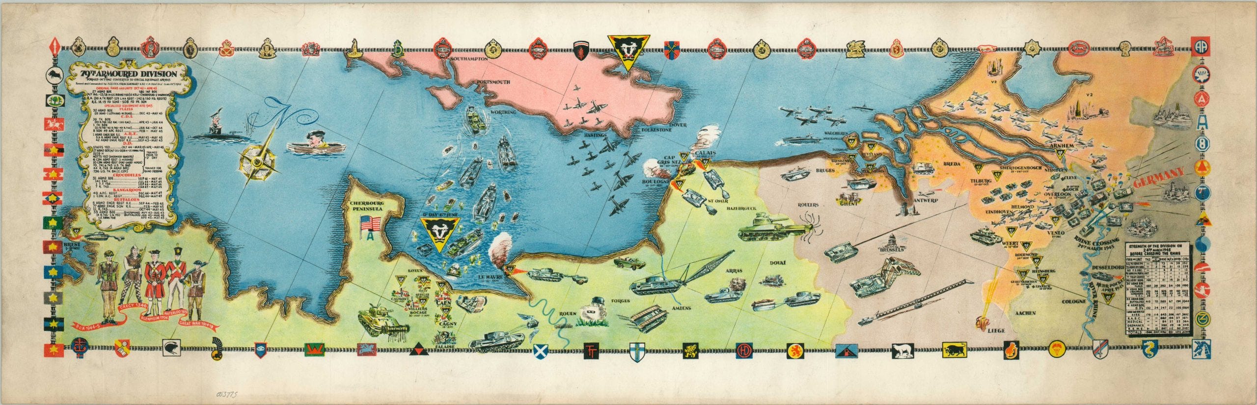
Britain’s 79th Armoured Division commissioned an elongated pictorial chronicle of its time in north west Europe. From the training grounds in Britain in October 1942, across the Cherbourg peninsular, on through Normandy, it maps out the routes for flying dustbins, crabs, crocodiles and the like ~ all the way to Hamburg, in June 1945. The division’s official history, The Story of 79th Armoured Division, was privately printed in Hamburg in 1945 and is stuffed with colour maps ~ forty of them ~ plus this loose, louche, visual record that is, according to most booksellers, almost always missing. Most records credit the maps in that book to the division, generally, or at best, the Royal Engineers.


America’s 79th Infantry Division had a set of four maps, and we do know these were drawn by two of its own men. Stephen Kaliher, who’d been a surveyor before enlisting in 1942, and Harry D. White, a draughtsman ~ which is the internet’s way of saying he was probably a surveyor, too. Their works of art were printed after the war, in Dortmund, in 1945, by a German publisher ~ Fritz Busche Druckereigesellschaft ~ rather than an American army unit.
Still, as a medium, campaign maps belong to a much older family, the pictorial map, which has spent most of its life being patted on the head. Pictorial maps aren’t real maps, the thinking goes, because they aren’t scientific ~ they’re decoration, advertising, something for the schoolroom wall. The Second World War rather spoiled that, with a pressing need to convey what was happening ~ where ~ to an audience that wasn’t familiar with the many, many pages of a world-encompassing atlas. Pictorial maps of the 1940s turned serious, and campaign maps went with them. They’re persuasive, too, in the proper sense. Here, though, the audience isn’t the folks back home ~ it’s the unit itself. This is who we are. This is what we did.
Texas A&M University (the A is for agricultural, the M is for Mechanical), holds what may be the largest collection of campaign maps, and its historians try to divine the mood of those maps’ makers, in the months after the war. Other nations’ campaign mapping has not ~ yet ~ been collected and curated in the same way. You will find examples online, and in antique dealers’ backrooms, and attics, and archives. Largely unstudied, and in the case of the map at the top of this page, not online at all, and rarely given a second look. Which is where I come in, I suppose.
All of life is lived on a map. Those lives, lived, are worth remembering, and so are the mapmakers, themselves.
A FINGER IN THE MUD
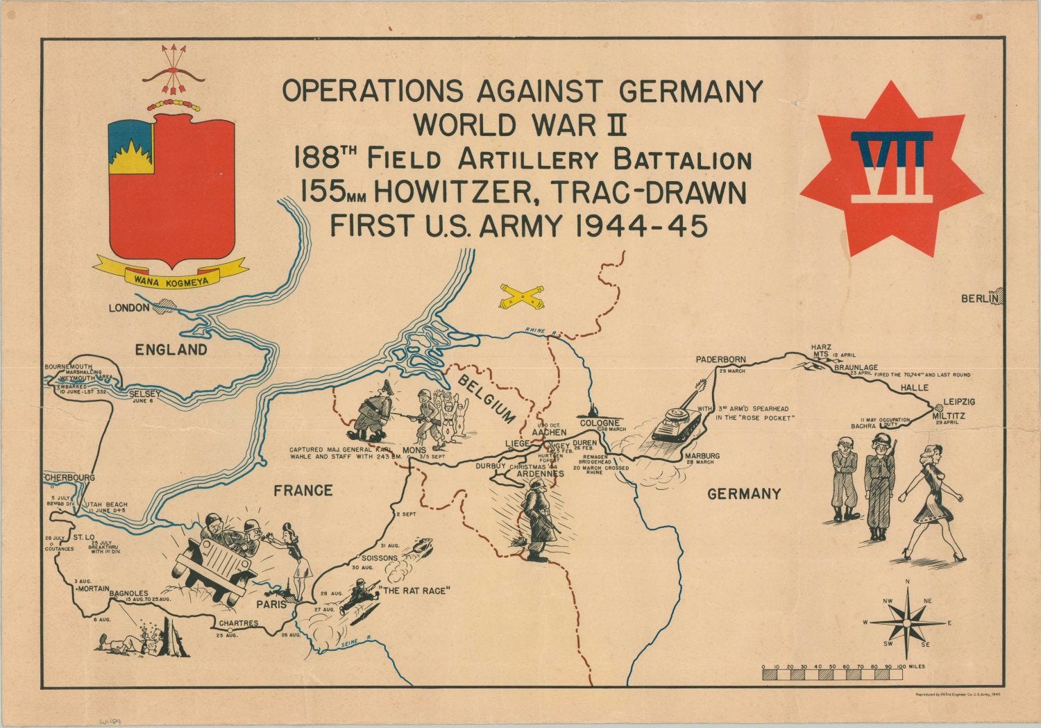
People can’t help it ~ men have to put things on a map. People drew on cave walls with charcoal from the fire, and we have every pub table in Britain covered in beer-mat diagrams of how the match should have gone. Leave a man stuck in the mud and the blood for long enough and he’ll put a gnarly finger into the dirt, draw a line, and start saying something about what was here, and what was there, on either side of the line. Not because anyone asked him to, but because some things don’t go into words, or not easily, and a line on the ground will do what a sentence can’t. Here’s where they were. Here’s where we went. Here’s where it all went wrong. You had to be there, man.
We’re quite comfortable, these days, being reflective about First World War poetry and First and Second World War works of visual art. Paintings are a genre. They have shelves, anthologies, exhibitions, set texts, and entire communities ~ university curriculums ~ devoted to their study. Britain even had an official scheme for it in the Second World War: artists were commissioned to record the war, and the results were bought, hung and catalogued for the nation. Nobody commissioned P. Todd. So why aren’t campaign maps a genre, too?
Given my moment, I will state that it is because people see maps as tools, and nobody asks who made a tool. You don’t ask who made a spanner. Which factory made the hammer, or who packed the nails. But somebody drew this mapping. Somebody chose to put that AVRE there, and that church here ~ and to leave out the bit nobody wanted to remember.
SO WHAT?
So we come back to where we started: the campaign map as a visual, illustrative medium, and its purpose as a catch-all of history. Put the two Lowland Division’s maps side by side again and you have the whole range in one family. At one end, the division’s: screen-printed, bordered in badges, reused on the cover of the official history ~ commemoration with the full weight of a division behind it. At the other, P. Todd’s: two colours, a pennant, a ruler and a great deal of patience, made for one brigade headquarters and run off in who knows how few copies. Official and informal. Complex and simple. One for the bookshelf, the other ~ most likely for the senior officers who served with 155 Infantry Brigade. Both, I’d argue, are works of art.
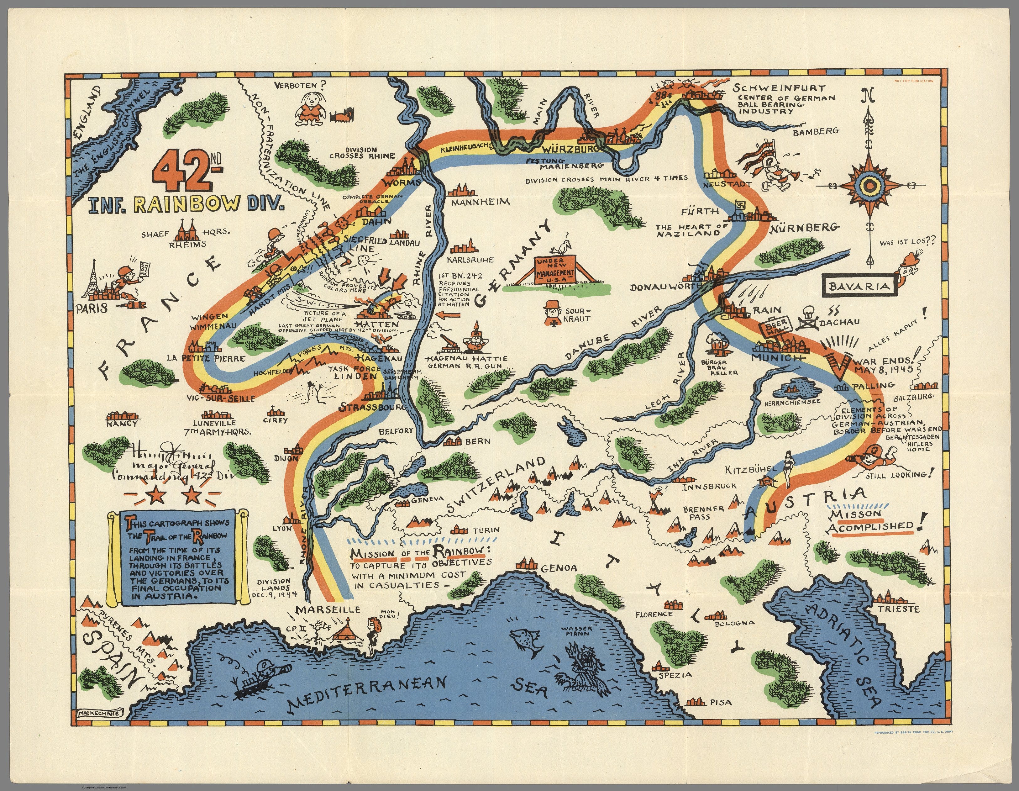
The Americans had exactly the same range ~ maps reproduced by Engineer topographical units with all the proper credits, and maps drawn by the unit’s own men and run off by the nearest German printer. The difference isn’t in the making. It’s in what happened next. America has, relatively recently, gathered those maps into a collections and set historians loose on them. Britains have adopted a more discreet role in the pantheon of historiographical importance, by slipping into regimental histories, and settling into art dealers’ folders and attics.
Either way, a campaign map tells us something, instantly, that a linear record replete with tables and lists never can ~ who was there, how those people chose to remember their time, and what they thought mattered enough to draw. That’s the record. The deliciousness is in the rest of it ~ the choosing of the details. What gets a boxout and what doesn’t; which village earns a date and which is left to someone else’s memories; a pennant at one end and a signature at the other. A war diary tells us what happened, but a campaign map tells us what its makers want us to remember, and to an extent, how they want us to feel about the men involved. This kind of mapping has character, that character prompts emotion, and that, dear reader, makes it all a work of art.
The story of how maps were made for military histories written after the war is a whole other thing, of course. But that’s a story for another day.
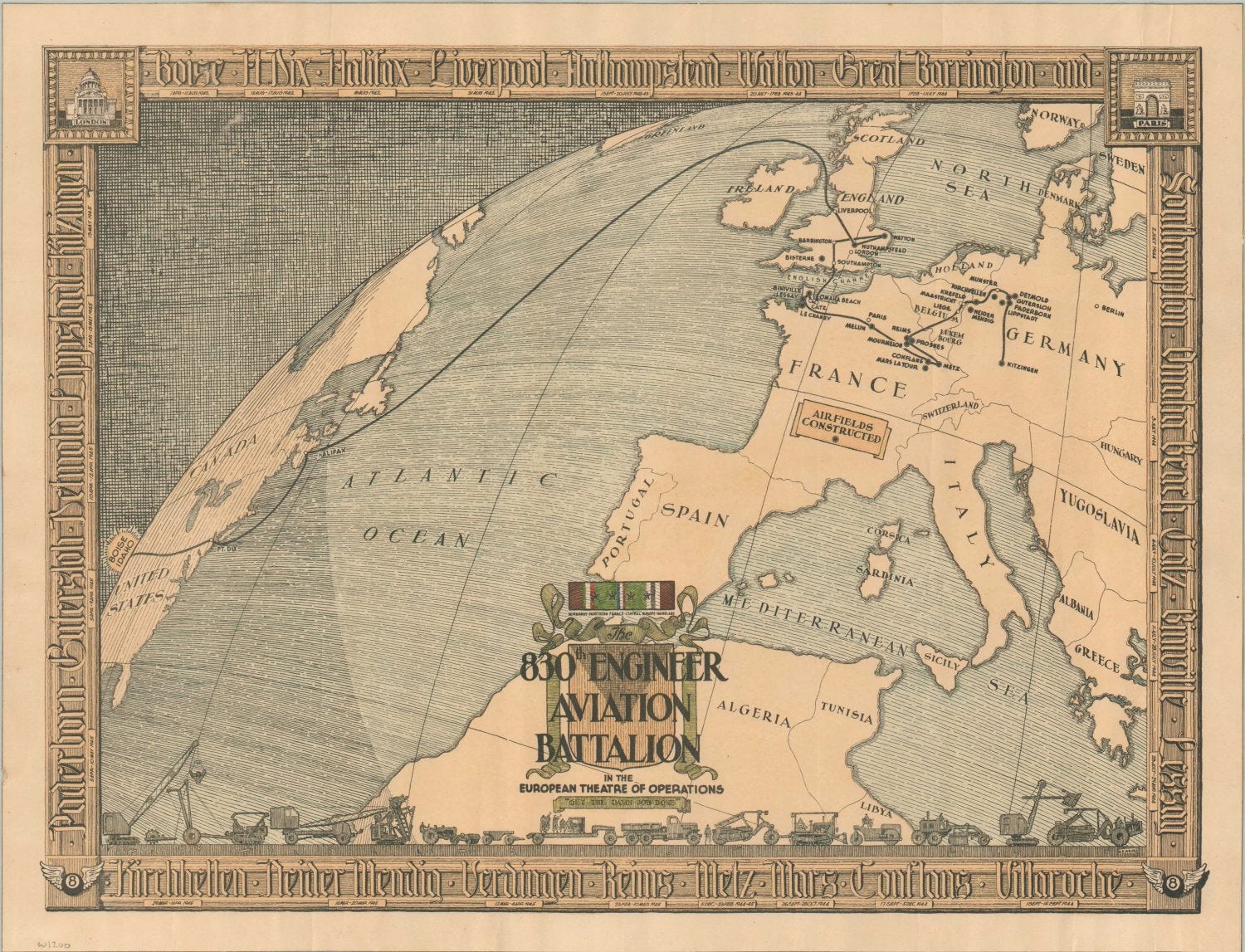
In the meantime, here’s one of my ~ many ~ favourite campaign maps. It’s not the most evocative piece of historiography; it’s not a lens through which to understand the minutiae of the 830th Engineer Aviation Battalion’s route across Europe during WW2. But it’s simple; it’s clear; it explains a lot quickly, and ~ look at those margins, that hatching, and the ingenuity with which a journey is mapped out across time and space, half way around the world ~ and then tell me, this isn’t a work of art:
Loved this. I’m always amazed that my notes with maps get the most reach. Either the Substack algorithm really likes maps, or people seem to like them more than photos! I might have missed this in your piece, but where are you getting most of your maps from? I find it a bit of a headache with maps and including them in my work because of copyright and archives not liking people sharing images of their holdings without permission (which often costs £££). I mostly just have to take them from Wikicommons but yours seem more niche than what’s on there.
It’s a special thrill when I open a milhist book and it has a fold out map, one or two of my official histories of the Vietnam War have fold out maps. I am always impressed with the skill and artistry.